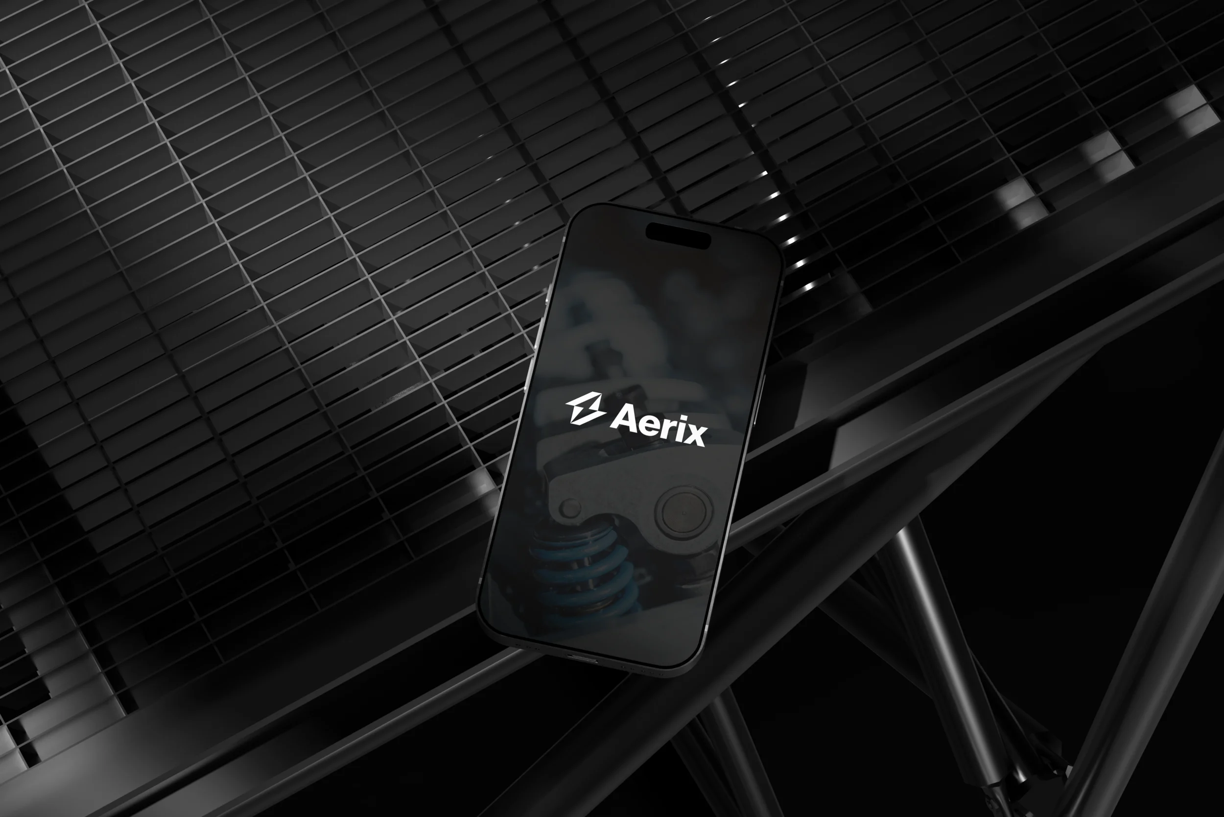
Aerix
Where next?
A complete brand identity system for an electric mobility company built around precision, reliability, and purposeful simplicity.
About
An electric mobility brand built for those who value progress and intention.
AERIX is an electric mobility brand built around precision, reliability, and purposeful simplicity. It focuses on creating vehicles that feel controlled, efficient, and ready for the future — without unnecessary complexity.
Designed for those who value progress and intention, AERIX represents a smarter, more dependable way to move forward.
Mission
To engineer dependable electric vehicles that make clean mobility practical and reliable.
Vision
To make precision-built, intelligent mobility the everyday modern standard.
Purpose
To simplify electric mobility through thoughtful engineering and intentional design.
Values
Precision, reliability, purposeful simplicity, and long-term thinking.
The Problem
Most EV brands feel like a compromise.
Most electric vehicle brands feel like a compromise on reliability, durability, design, and longevity. The category is cluttered with brands that lean on futurism as shorthand for quality — but say very little about engineering, trust, or staying power.
The goal was to position AERIX differently: serious, intentional, and bold — rooted in precise engineering that is reliable and built to last. Not another startup aesthetic. A mark that feels earned.
The Solution
Reliable, powerful, and built for the future.
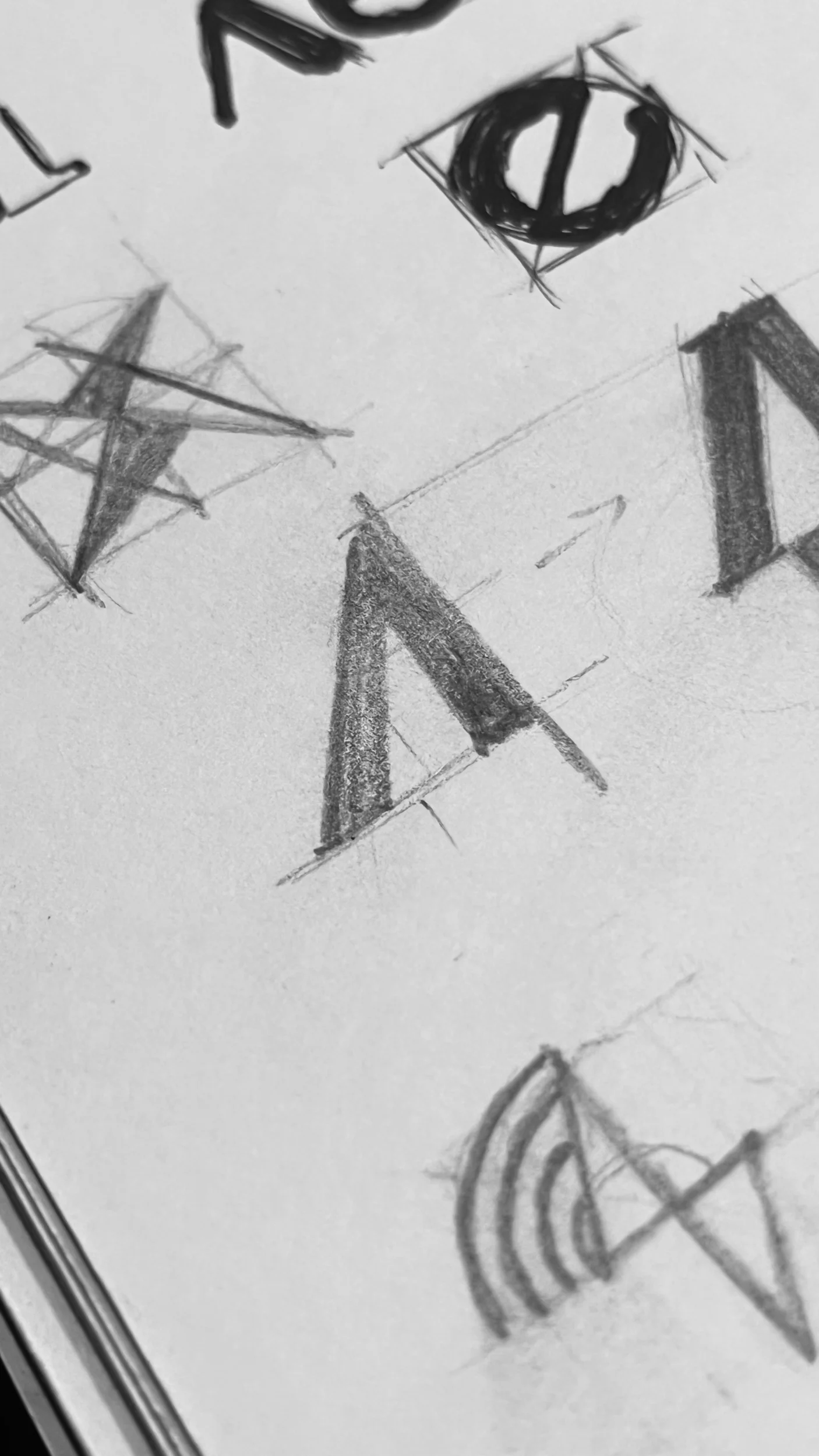
The project began with market research and competitor analysis to understand the EV space — its visual conventions, its clichés, and its gaps. This was followed by extensive sketching and logo explorations, testing dozens of directions before narrowing to one.
Inspired by 1960s German-Swiss design, the final identity focuses on precision, simplicity, and clarity. Every element of the system is intentional — nothing is decorative.
Typography

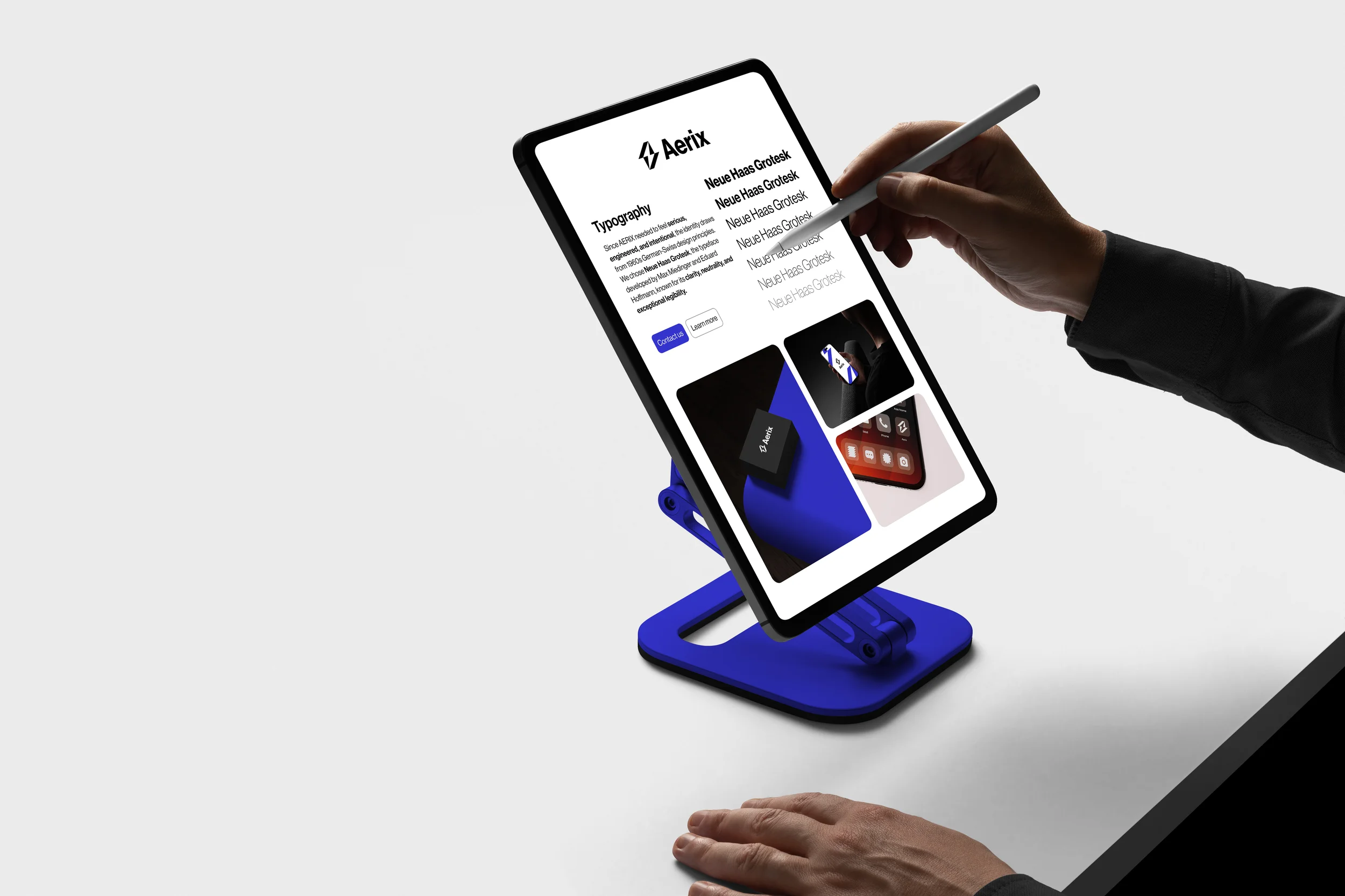
Neue Haas Grotesk
Since AERIX needed to feel serious, engineered, and intentional, the identity draws from 1960s German-Swiss design principles. Neue Haas Grotesk — developed by Max Miedinger and Eduard Hoffmann — was chosen for its clarity, neutrality, and exceptional legibility.
It carries the weight of a serious engineering brand without the coldness of more mechanical typefaces. Used at a range of weights and scales, it brings discipline and warmth in equal measure across every touchpoint.
The Process
Research, strategy, sketch, refine.
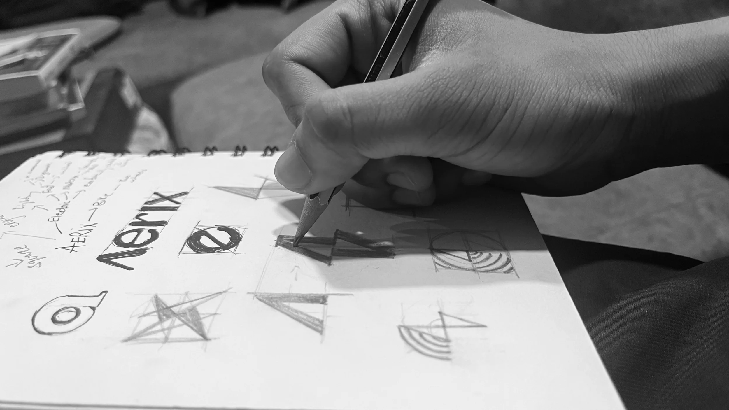
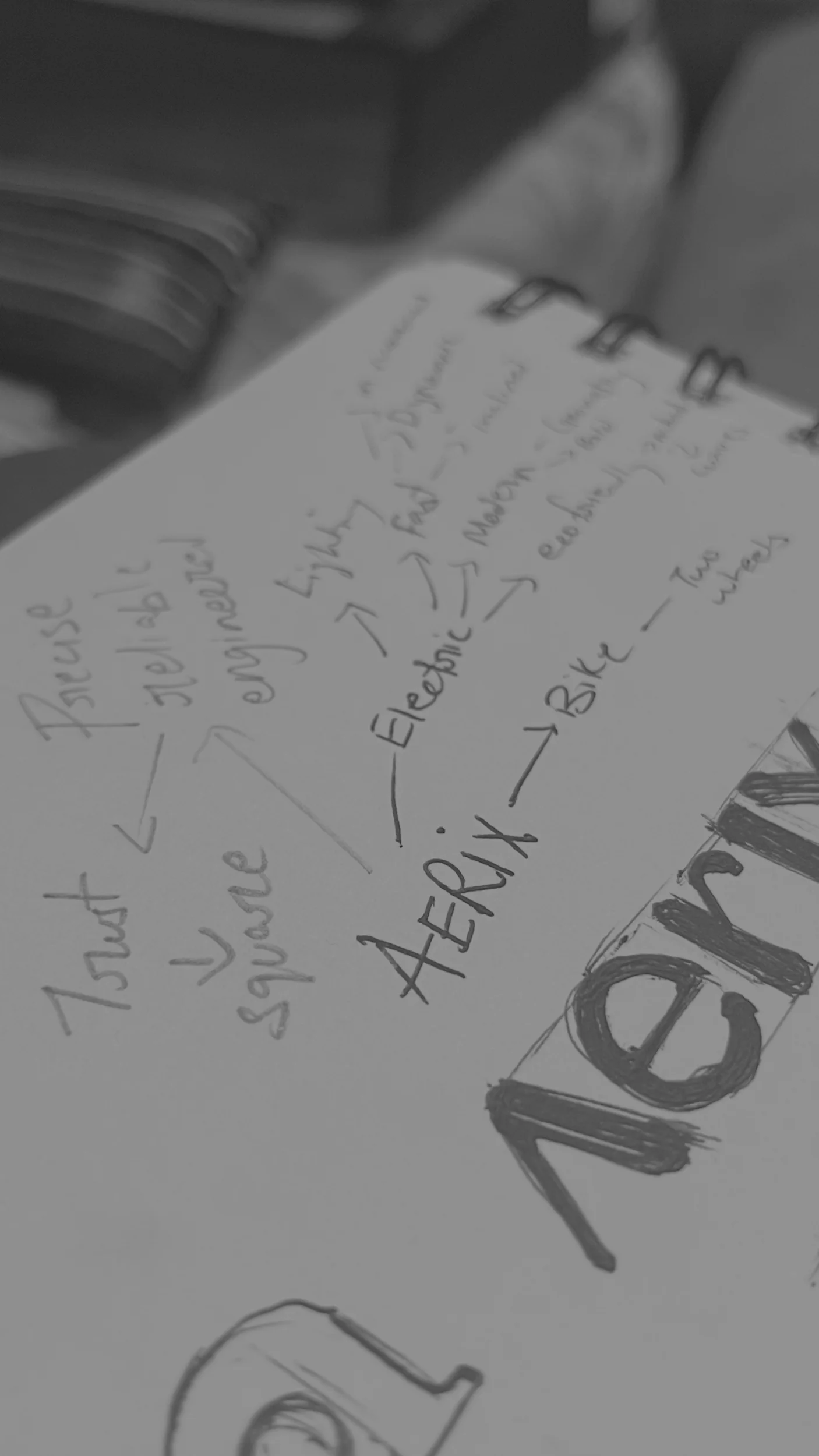
We began with competitive research to understand visual and positioning patterns in the EV market, then used mind-mapping, brainstorming, and sketching to develop simple, memorable, and distinctive ideas aligned with the brand strategy.
The Concept
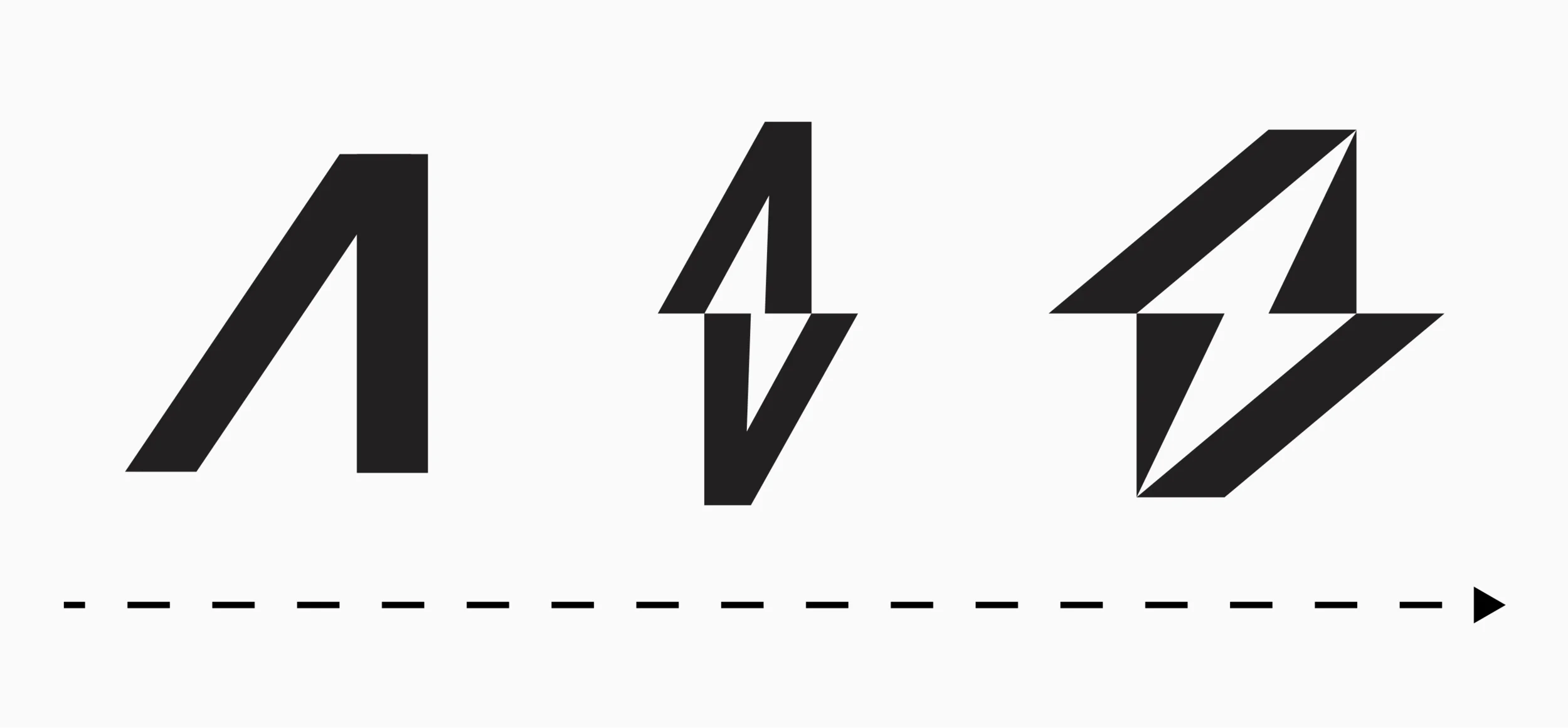
The letter A — strength, motion, energy.
The concept emerged from a minimal exploration of the letter "A" — using a bold vertical stroke to convey strength and a slanted bar to suggest forward motion. An electric symbol was then derived and refined for clarity, scalability, and memorability.

Colour System
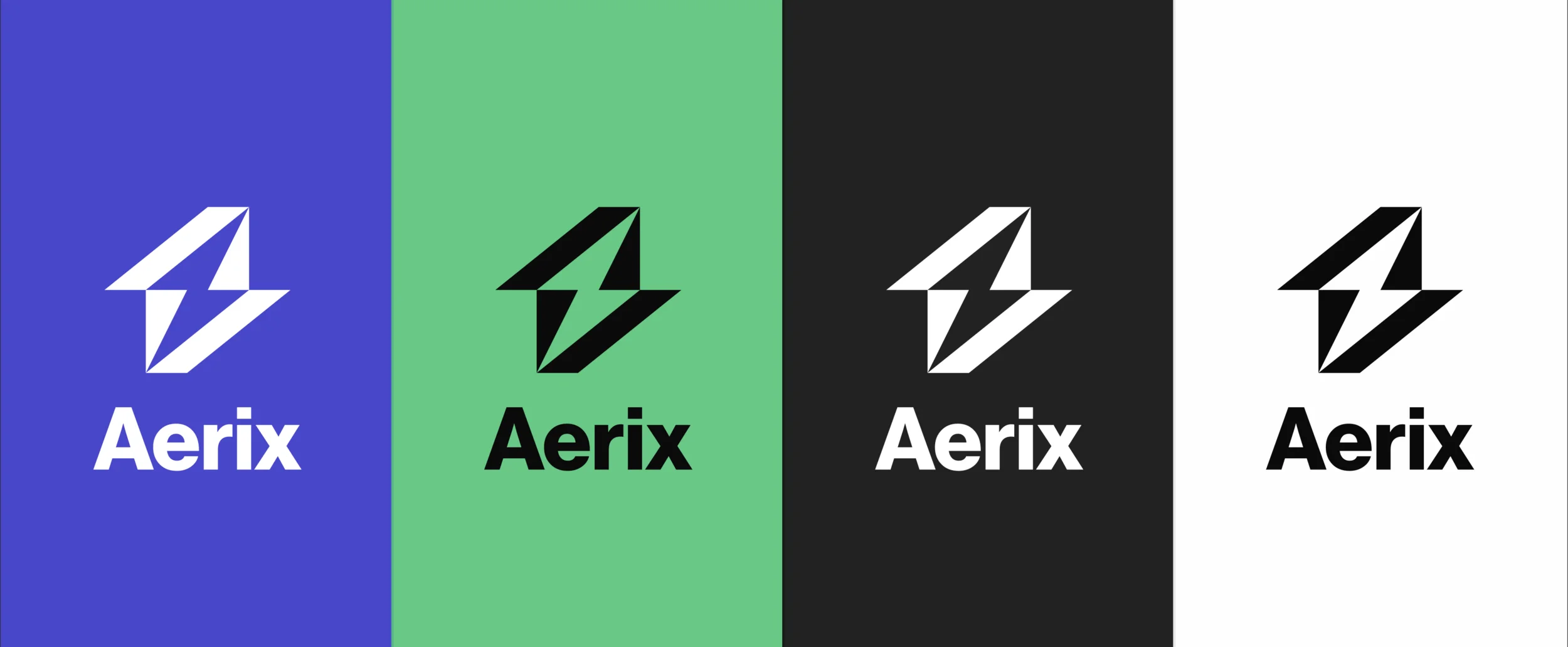
Restrained. Purposeful. Loaded with meaning.
AERIX needed to feel reliable, sustainable, and powerful. A restrained palette supports this — every colour earns its place. Blue for trust, green for sustainability, black for strength, white for purposeful simplicity.
Identity in Action
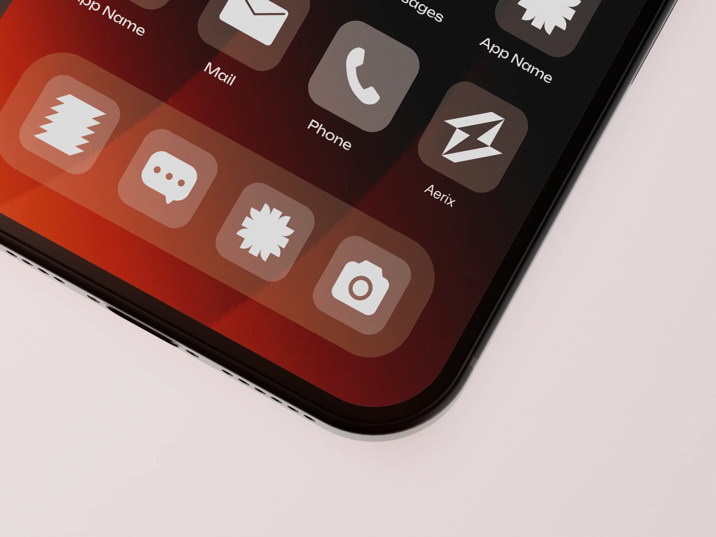
Simple, reliable, functional — across every surface.
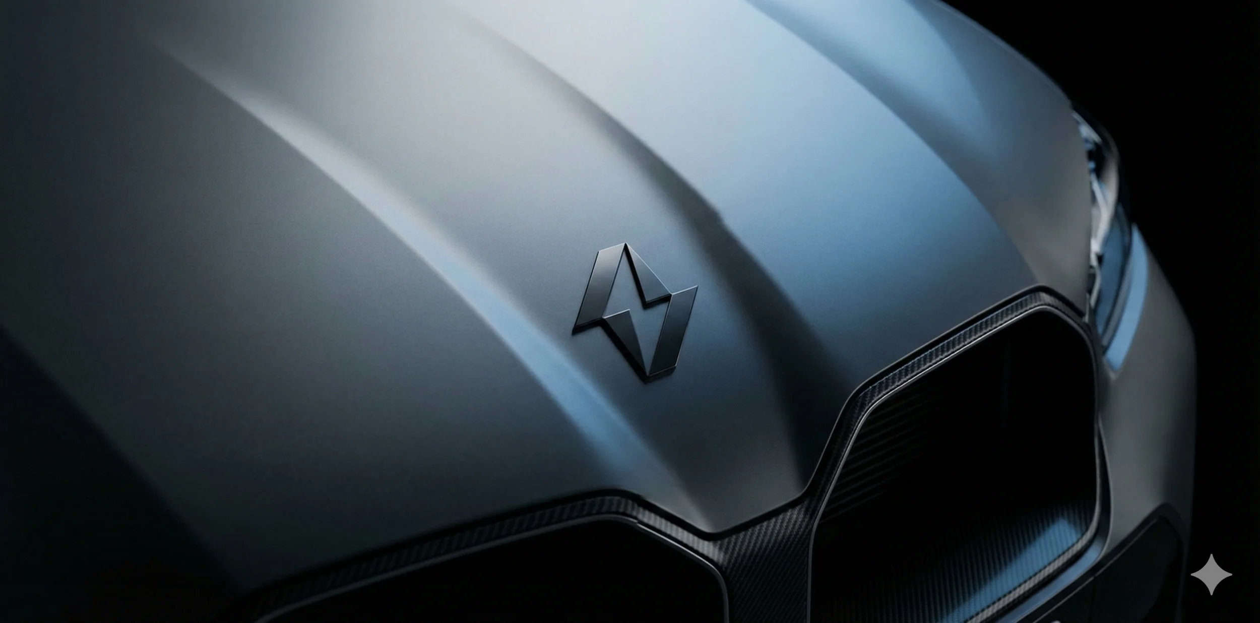
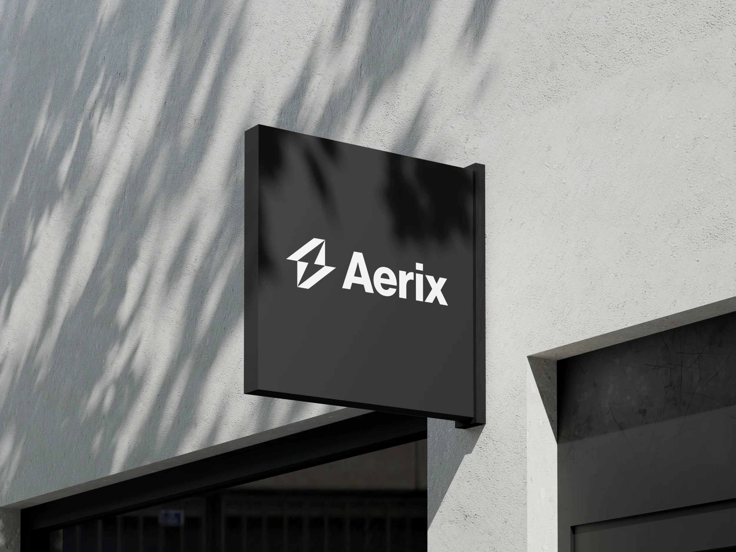
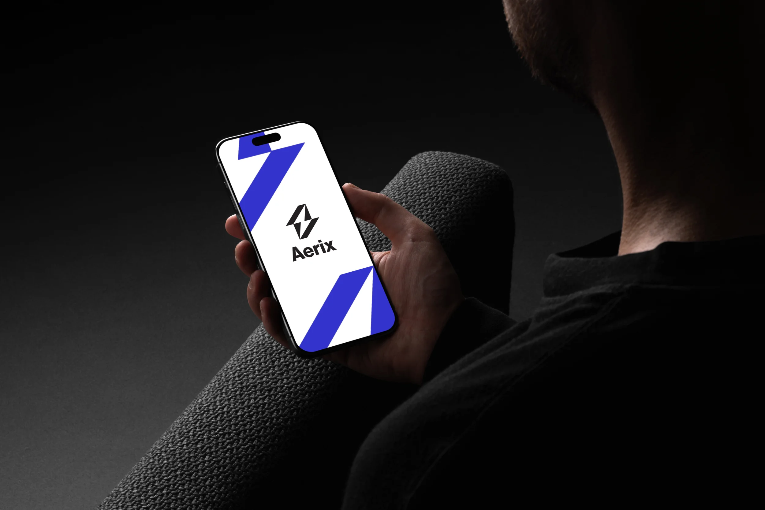
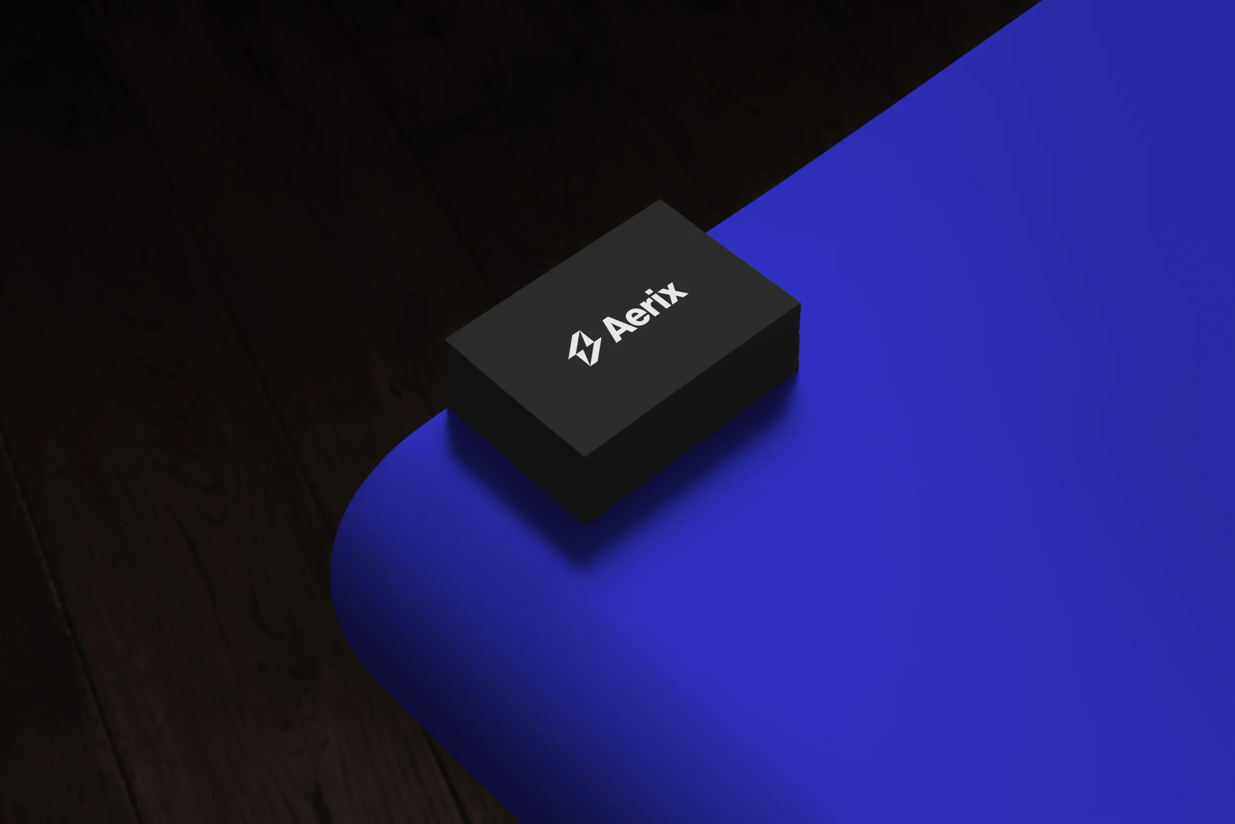
AERIX's identity was designed to perform consistently across real-world applications — from screens to vehicles to physical space.
Motion
The brand in motion.
A vertical brand identity film communicating the precision and forward momentum of the Aerix system — from the logo construction to the full identity reveal.