Bikaji Foods
Familiar, refined.
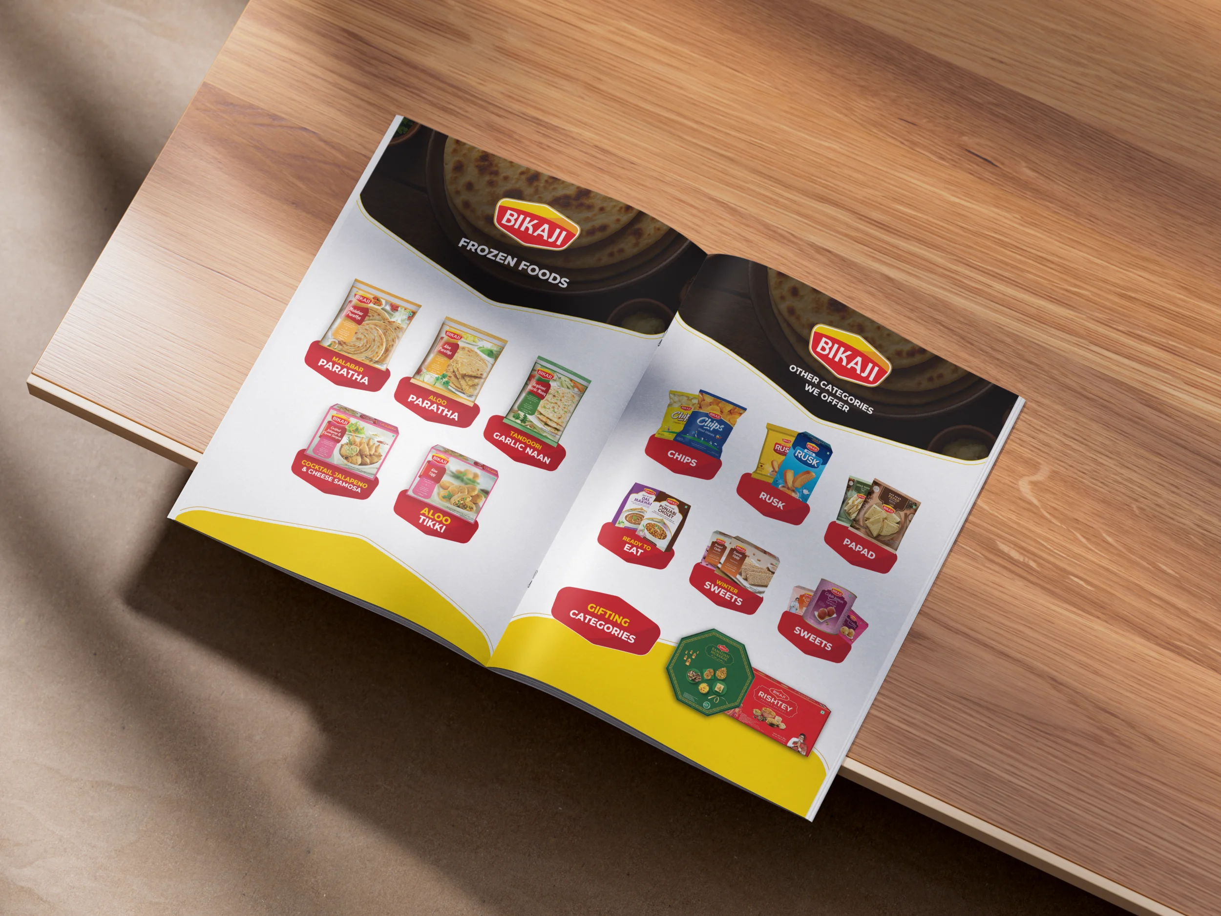
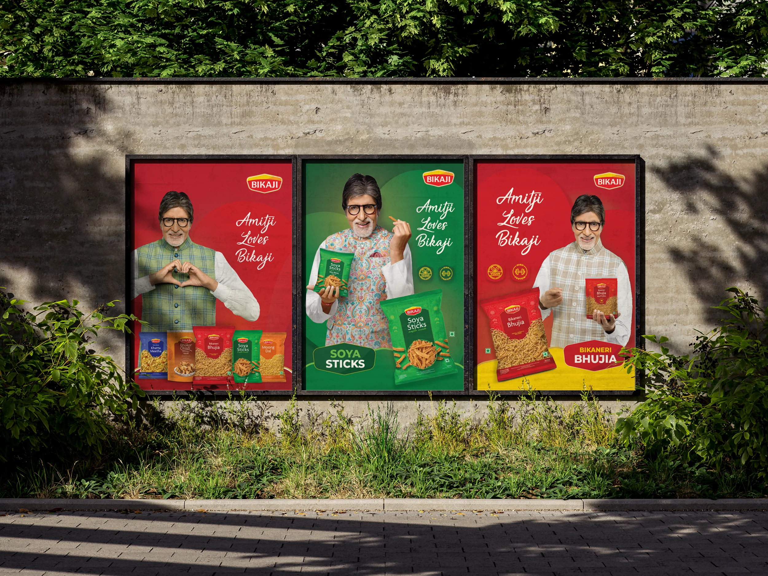
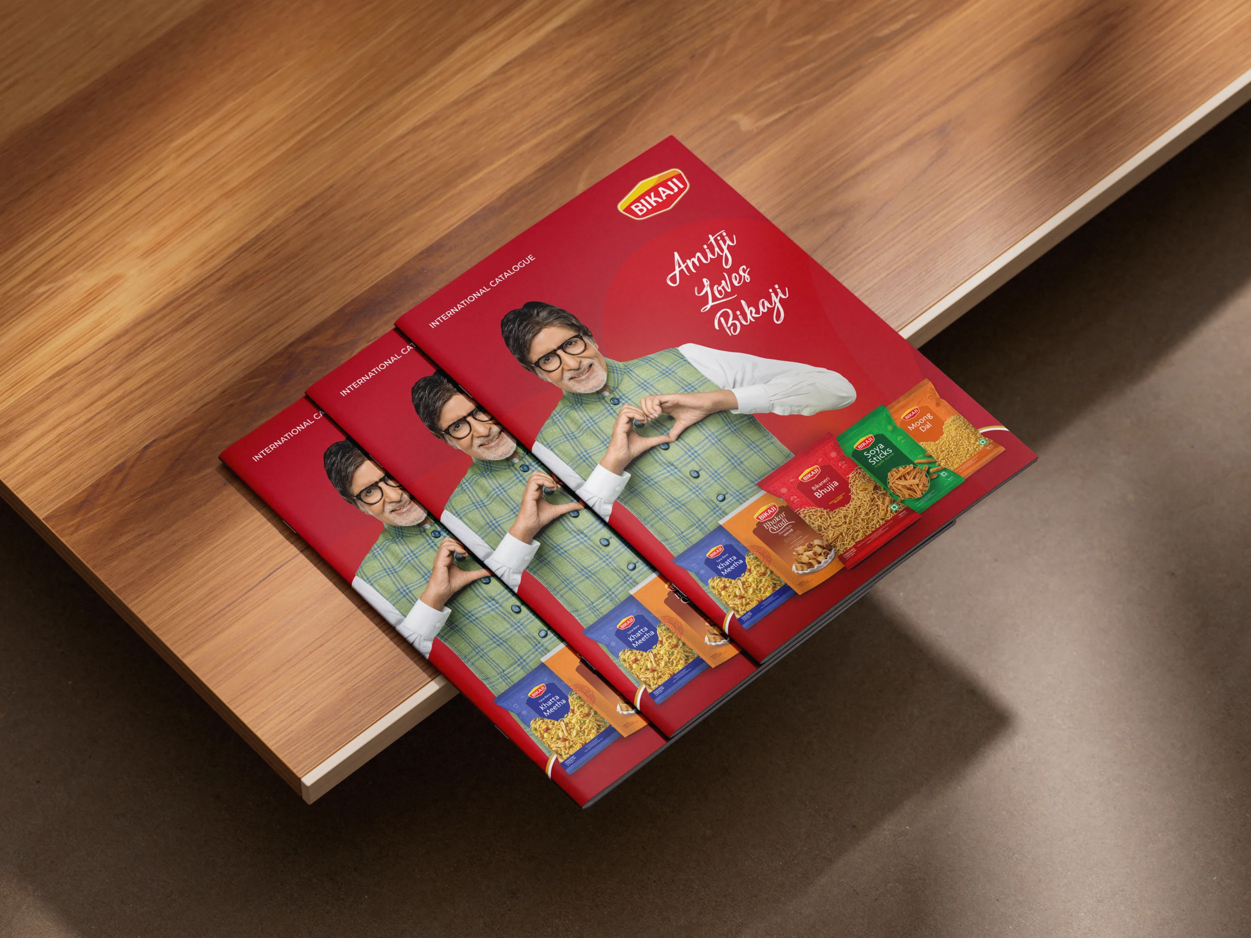
A refined brochure for one of India's leading snack brands — reducing visual noise while aligning the identity with international design expectations.
About
One of India's leading snack and packaged food brands.
Bikaji Foods International is known for its wide range of traditional Indian snacks and sweets. As the company continued expanding into international markets such as the UK, it required communication material that could better align with global design expectations while still retaining the essence of the brand.
The Problem
Too noisy for international standards.
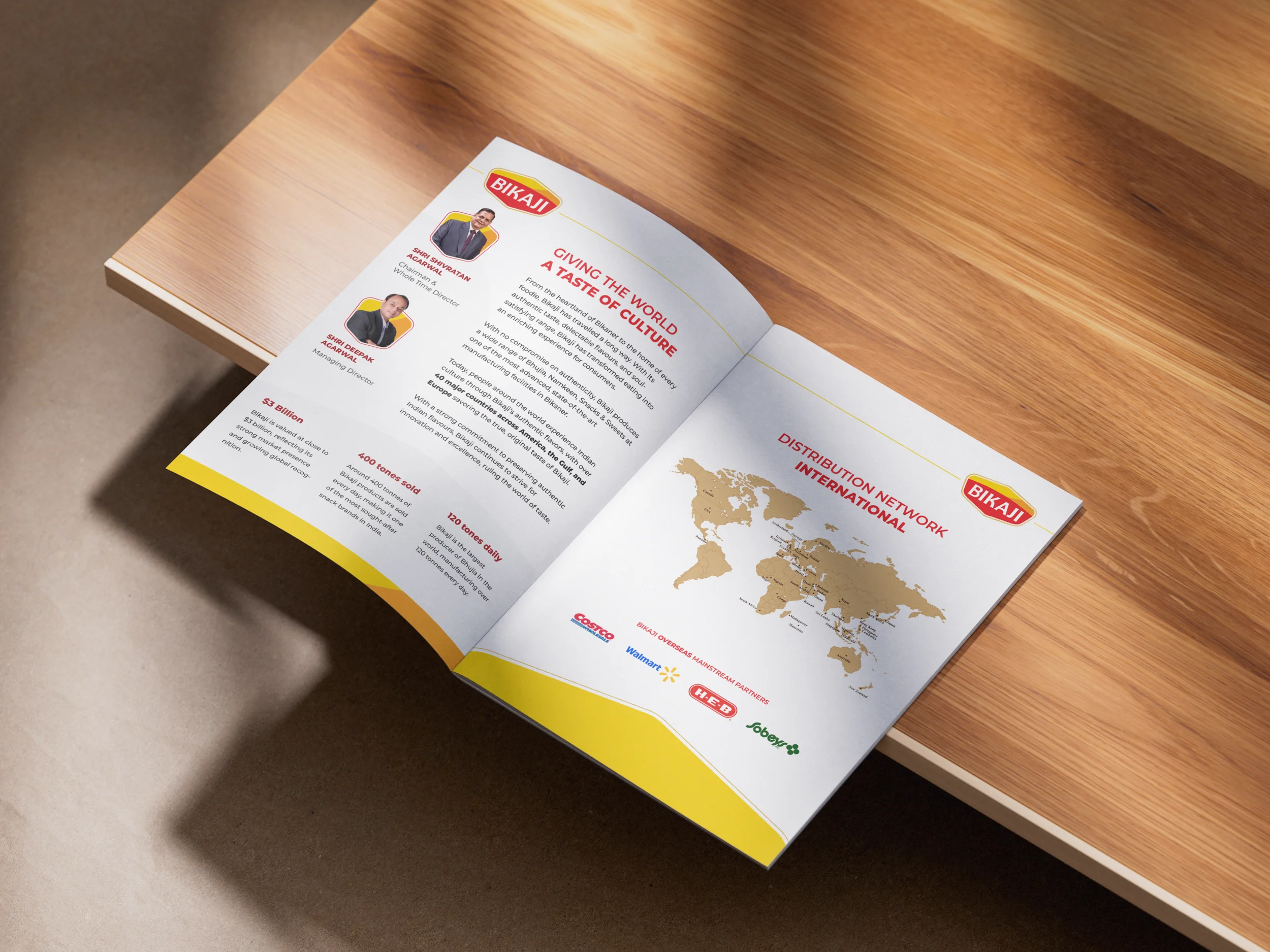
The client had an existing brochure but felt it was too noisy and would not work for international markets as they were expanding into the UK. There was also a recent logo update which had not been reflected in the style of the former brochure — creating a disconnect between the new brand direction and the materials being put in front of dealers.
The Solution
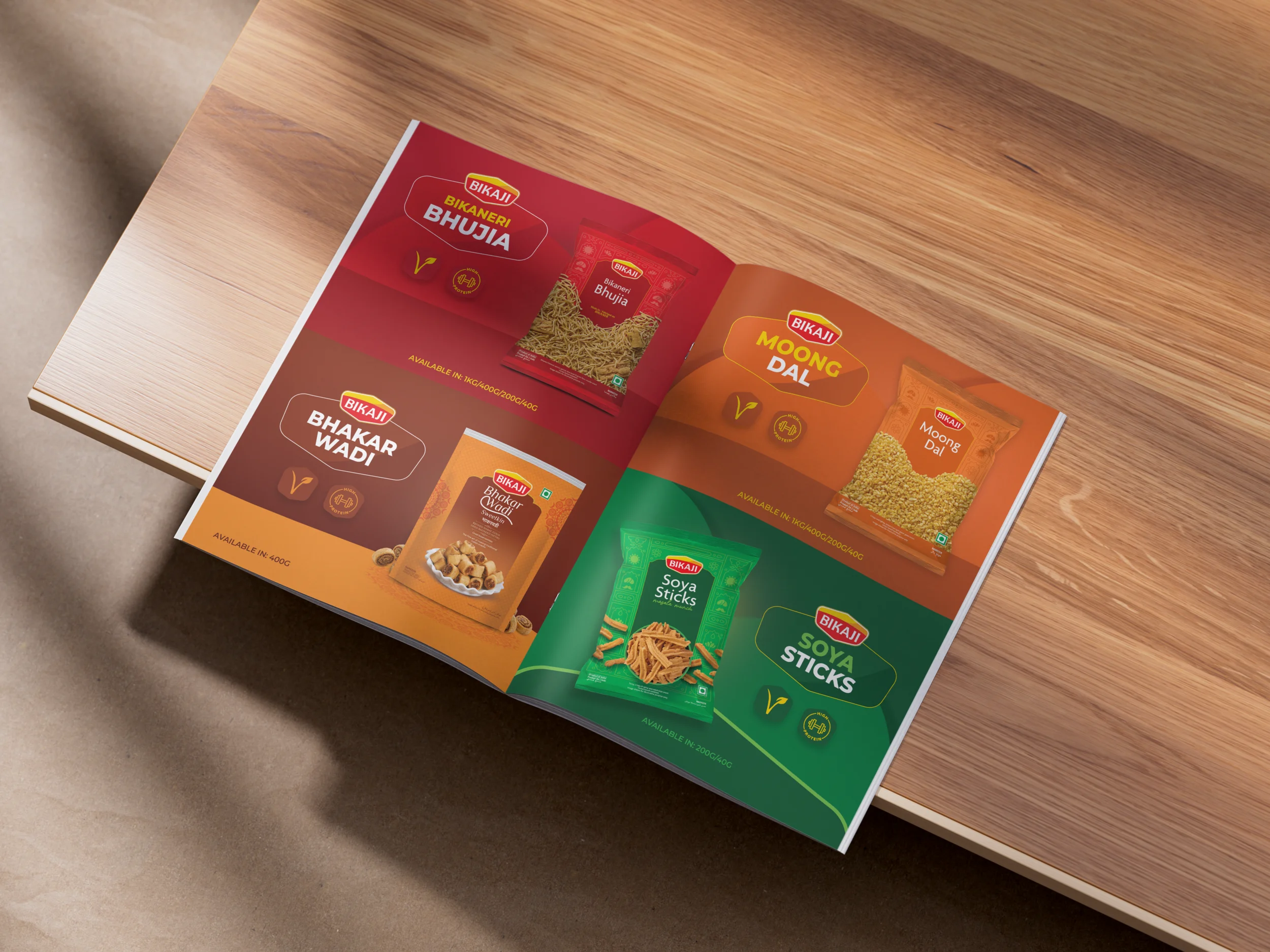
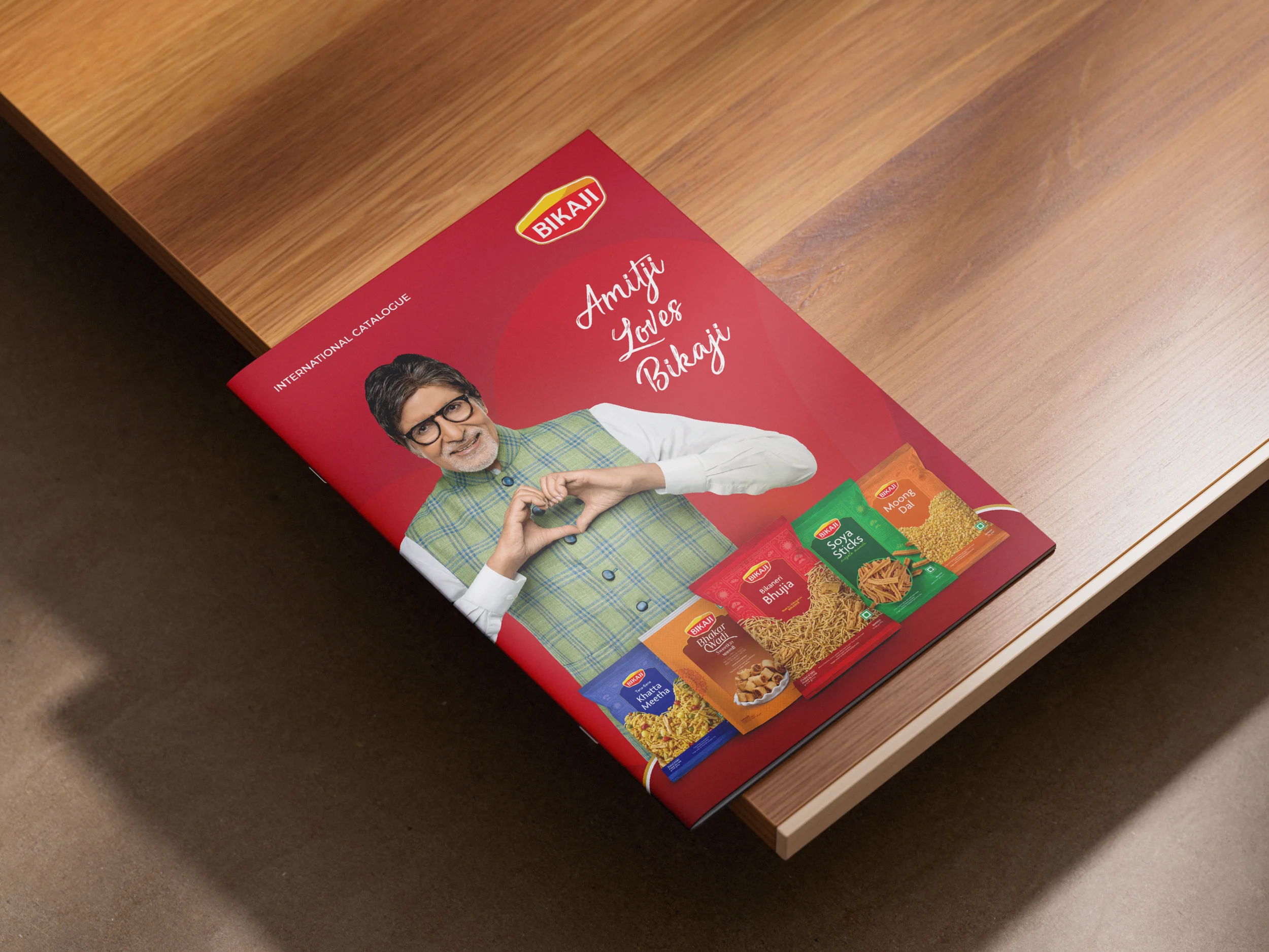
Clearer communication. Same familiar brand.
While aligning with Bikaji's existing style, the focus was on reducing visual noise and creating a clearer communication system so the products could be understood by dealers at a glance. The design language was refined to better meet international expectations while still maintaining the familiarity of the brand.