Seazen Exports
From ocean to world.
A bold logo identity for a seafood export company built around strength, global reach, and real-world visibility — from cargo trucks to international markets.
About
Premium seafood from the waters of the Indian Ocean.
Seazen Exports Pvt. Ltd. is a seafood export company sourcing premium seafood from the Indian Ocean. Built around quality, freshness, and sustainability, the company works closely with trusted fishermen and modern processing facilities to deliver high-quality seafood products across markets.
With a strong commitment to customer satisfaction and international standards, Seazen Exports aims to bring the rich flavors of the ocean to clients around the world.
The Problem
An identity built to perform beyond local markets.
The Seazen team needed a logo that felt distinctive and closely represented the nature of their business. The identity needed to work beyond local markets — the company was planning to expand internationally, including into Vietnam.
The challenge was to create a visual identity that communicated strength, reliability, global adaptability, and visibility across practical applications in the export industry. The initial direction explored a sleek and modern aesthetic, but further exploration revealed the need for a stronger and more functional visual system — one that could perform effectively across both digital and physical environments.
The Solution
Bold, built for distance, designed to last.
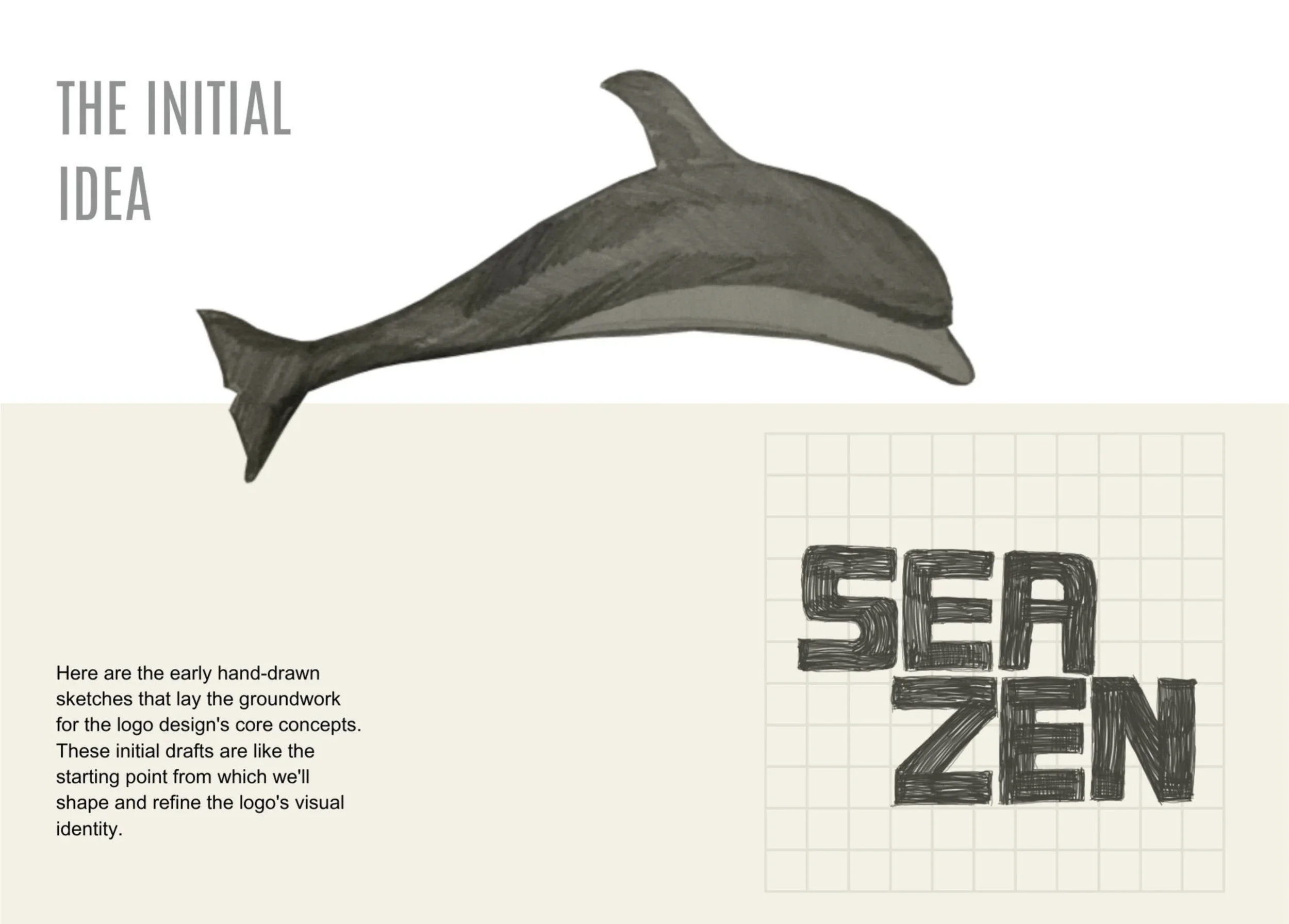
The final solution was a bold logo identity built around an orca as the primary logomark. The symbol was chosen to represent adaptability, global reach, collaboration, and strength — qualities that aligned closely with the company's ambitions and operational nature.
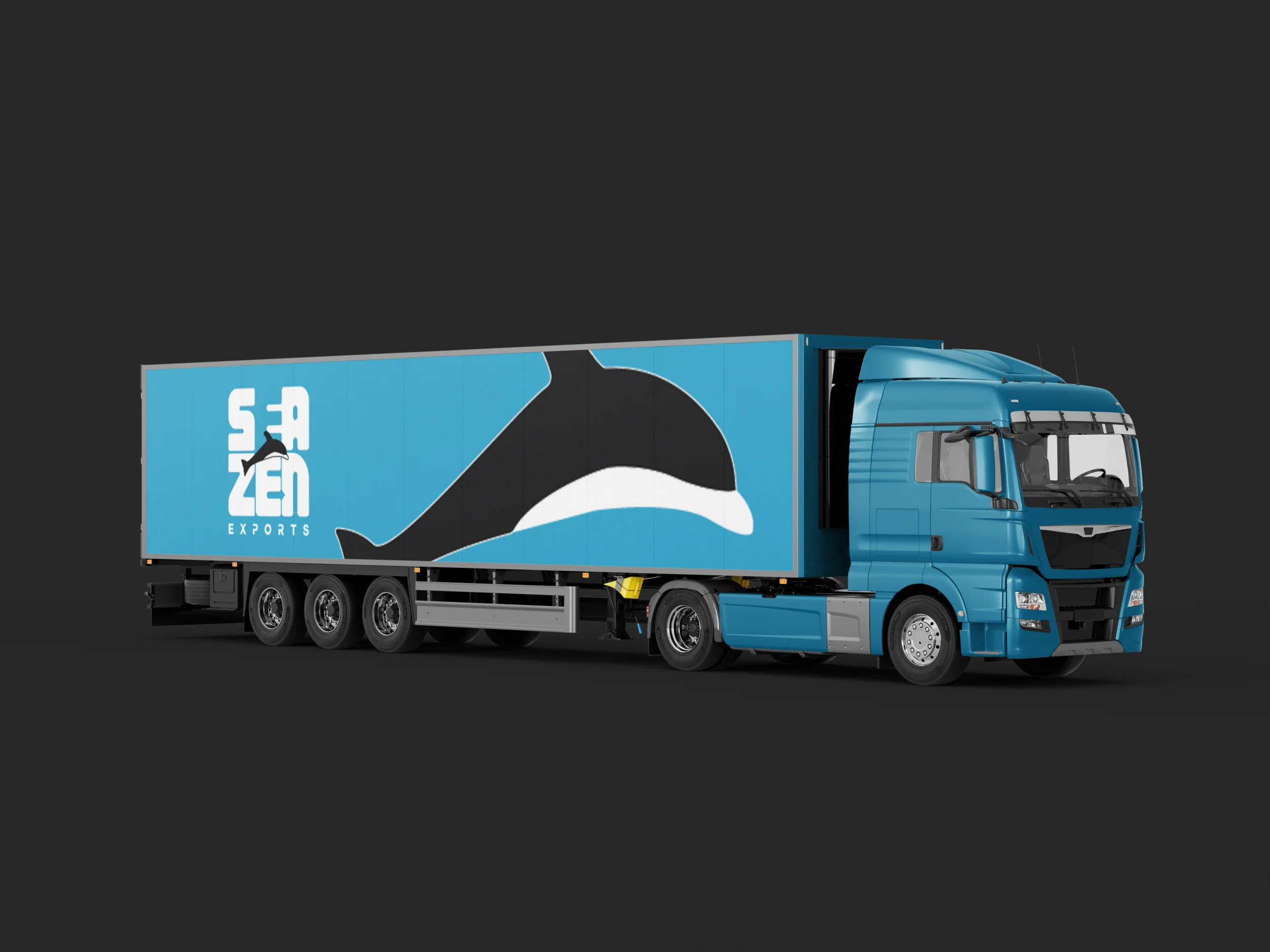
The logo was intentionally designed using thick, bold strokes to improve visibility and legibility from long distances — especially in real-world applications such as cargo trucks, shipping materials, and export packaging. This ensured the identity remained recognisable and impactful across multiple scales and environments.
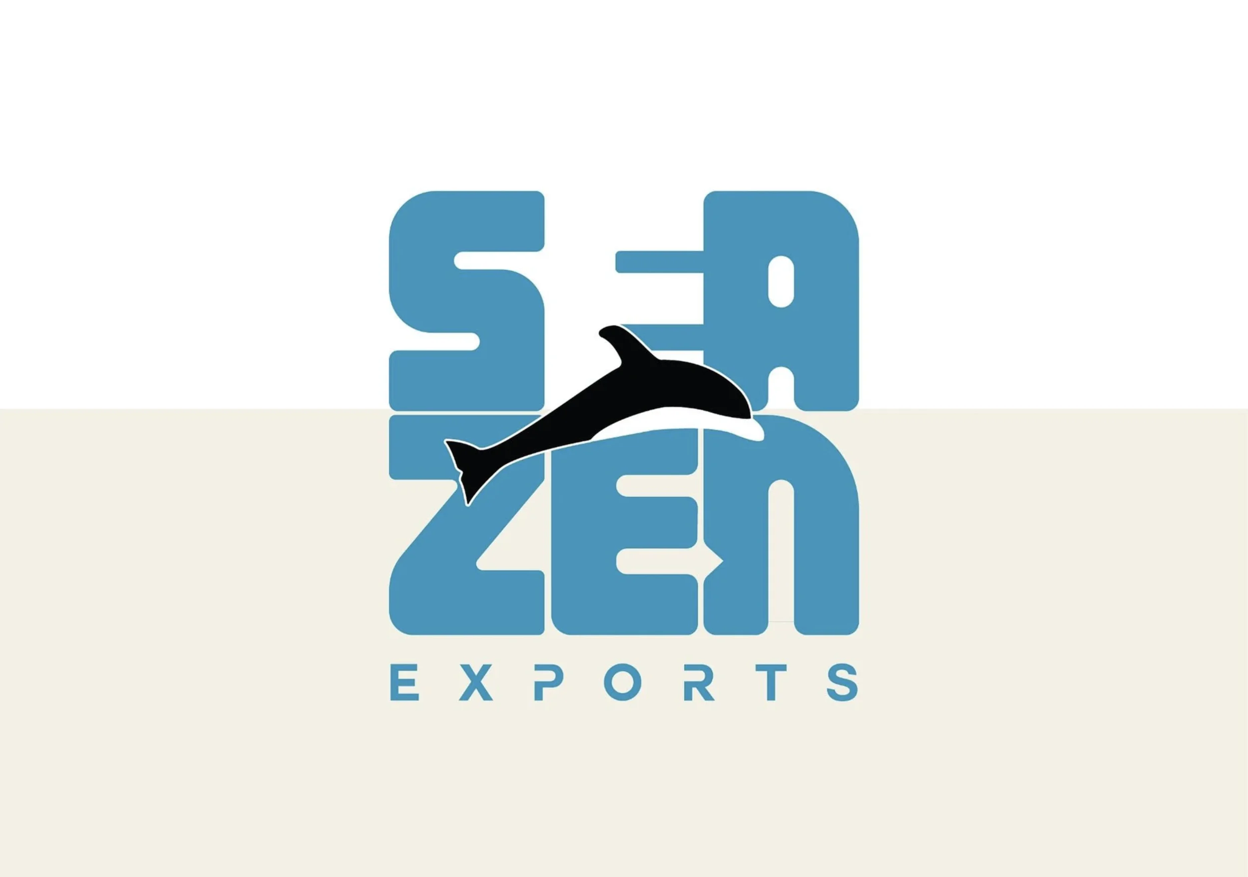
Early Explorations
Hand-drawn sketches that laid the groundwork.
These initial drafts serve as the starting point from which we shaped and refined the logo's visual identity — exploring the core concepts before any digital work began.
Typography
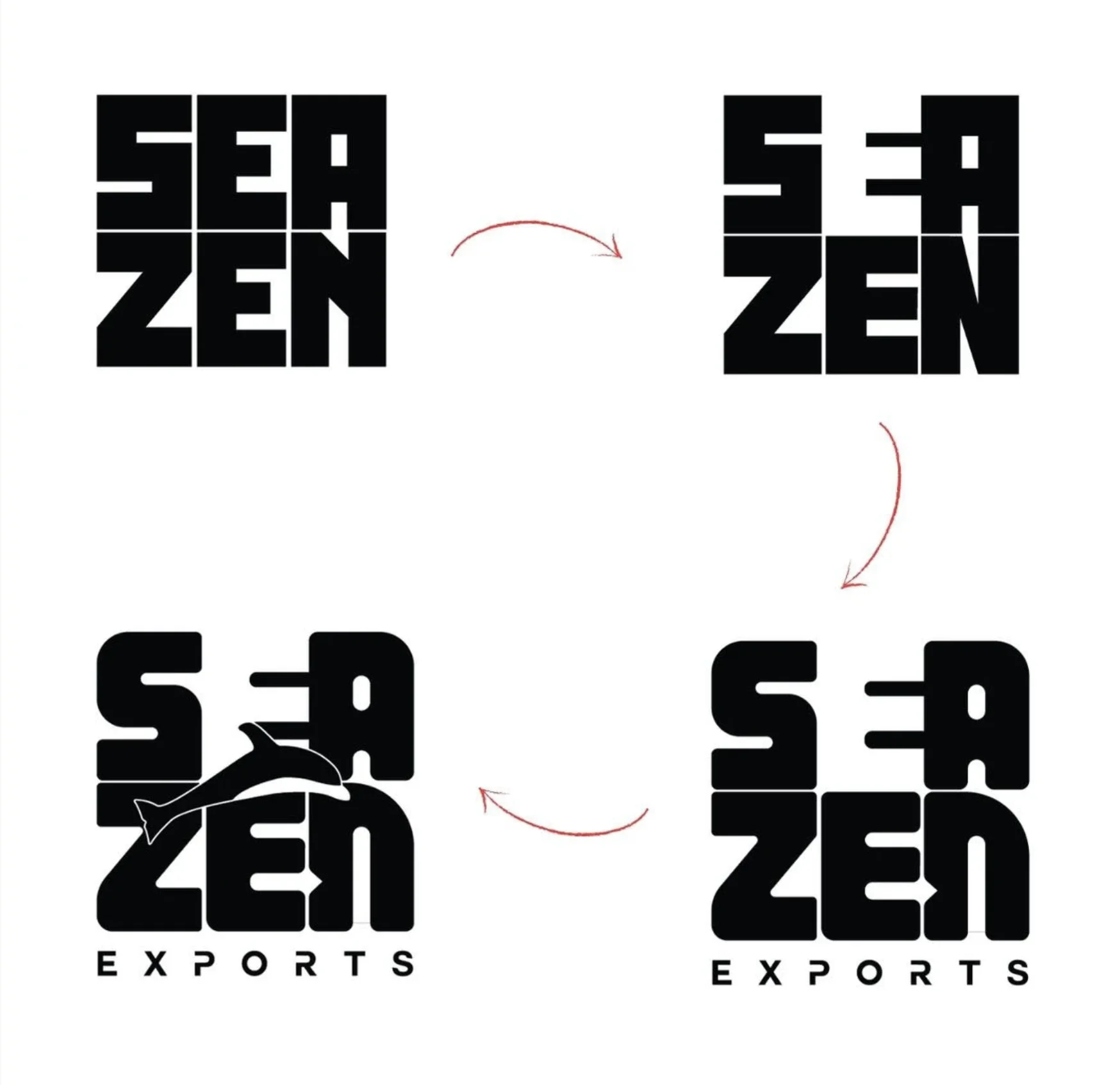
Squarely — bold, legible, and built to stand out.
The "Squarely" font was chosen for its boldness, embodying the strength and confidence that reflects the company's reliability.
Easy to Spot
Its bold character ensures the logo stands out and remains memorable across every application.
Customised Font
Personalised character modifications give the typeface a unique touch, setting it apart from conventional fonts.
Fits Anywhere
Whether on screen or in print, "Squarely" maintains its bold and clear appearance at any size.
Paired With
The custom typeface treatment works in concert with the orca logomark to form a unified, cohesive identity.
The Logomark
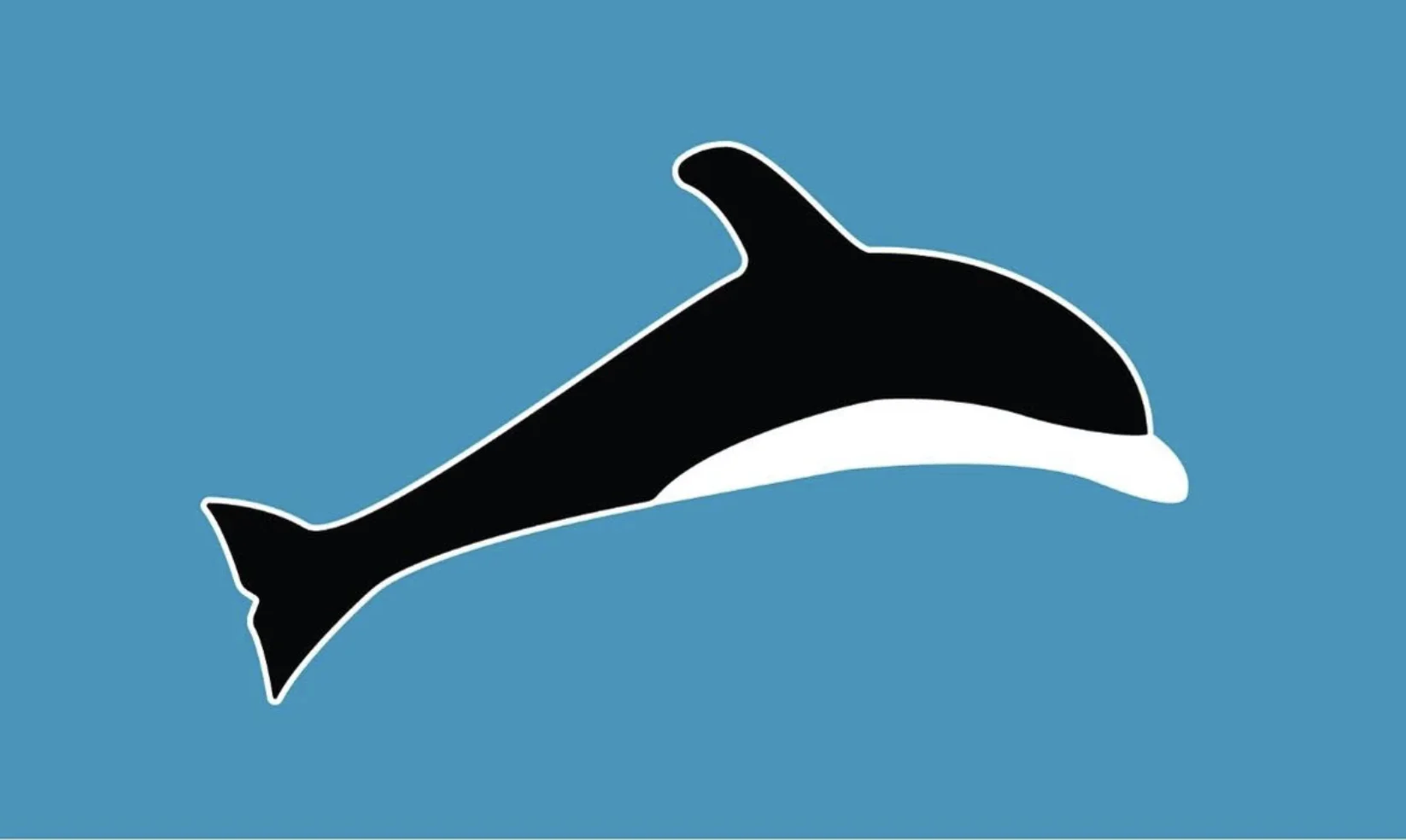
The orca — strength, reach, and collaboration.
The orca in Seazen Exports' logo symbolises global reach and adaptability, resonating with international connectivity. Reflecting the competitive nature of the industry, the orca's collaborative hunting behaviour mirrors the company's leadership and partnership-driven approach.
A powerful symbol capturing the majesty of a remarkable marine creature — leaving a lasting impression on stakeholders and partners.
The Arrow
Forward momentum — built into the mark.
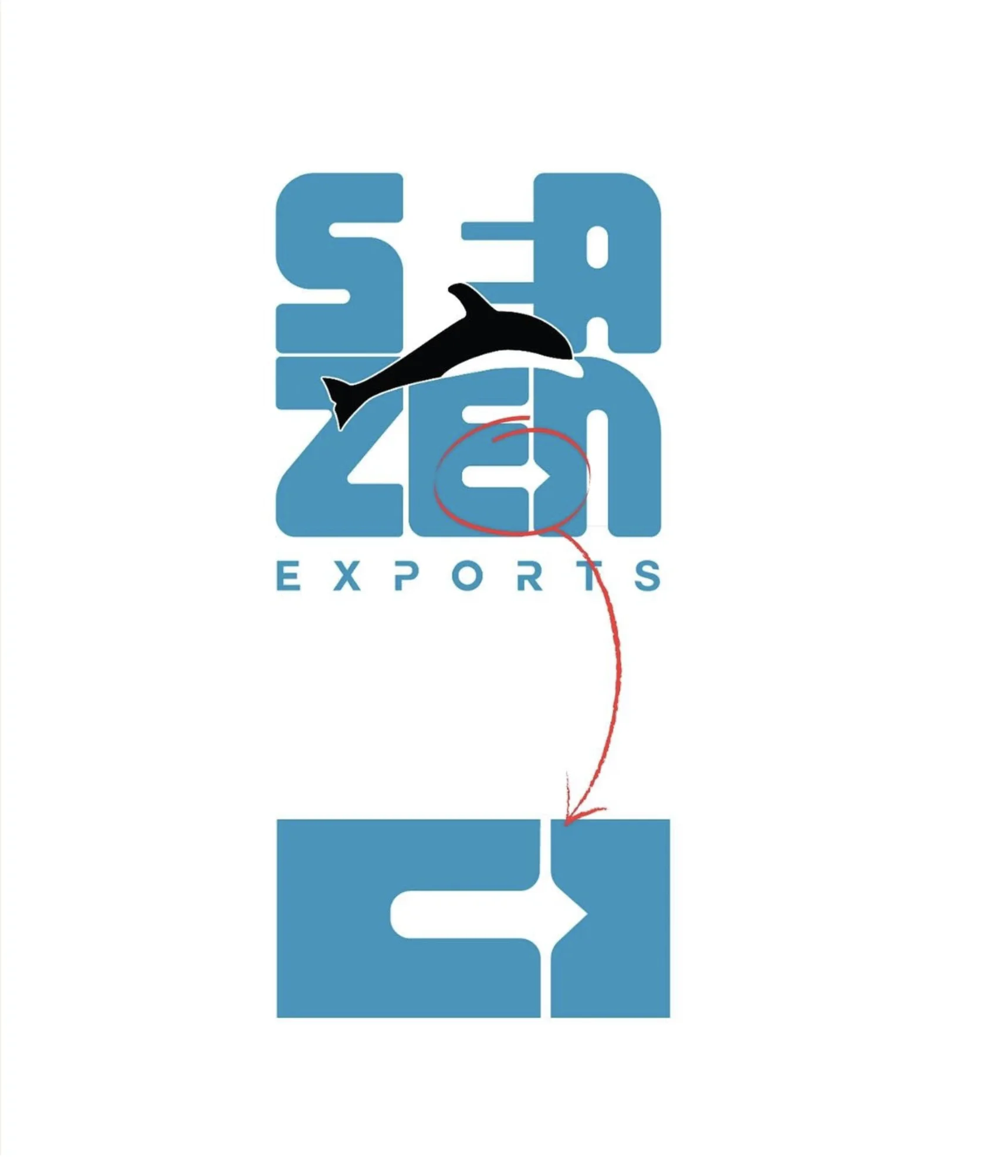
The arrow within the logo conveys a strong sense of forward momentum, symbolising progress and growth. Its dual significance subtly references the core nature of the business — exports — where movement and direction are essential.
This thoughtful emblem encapsulates both the company's ambition and its intrinsic character.
Colour System
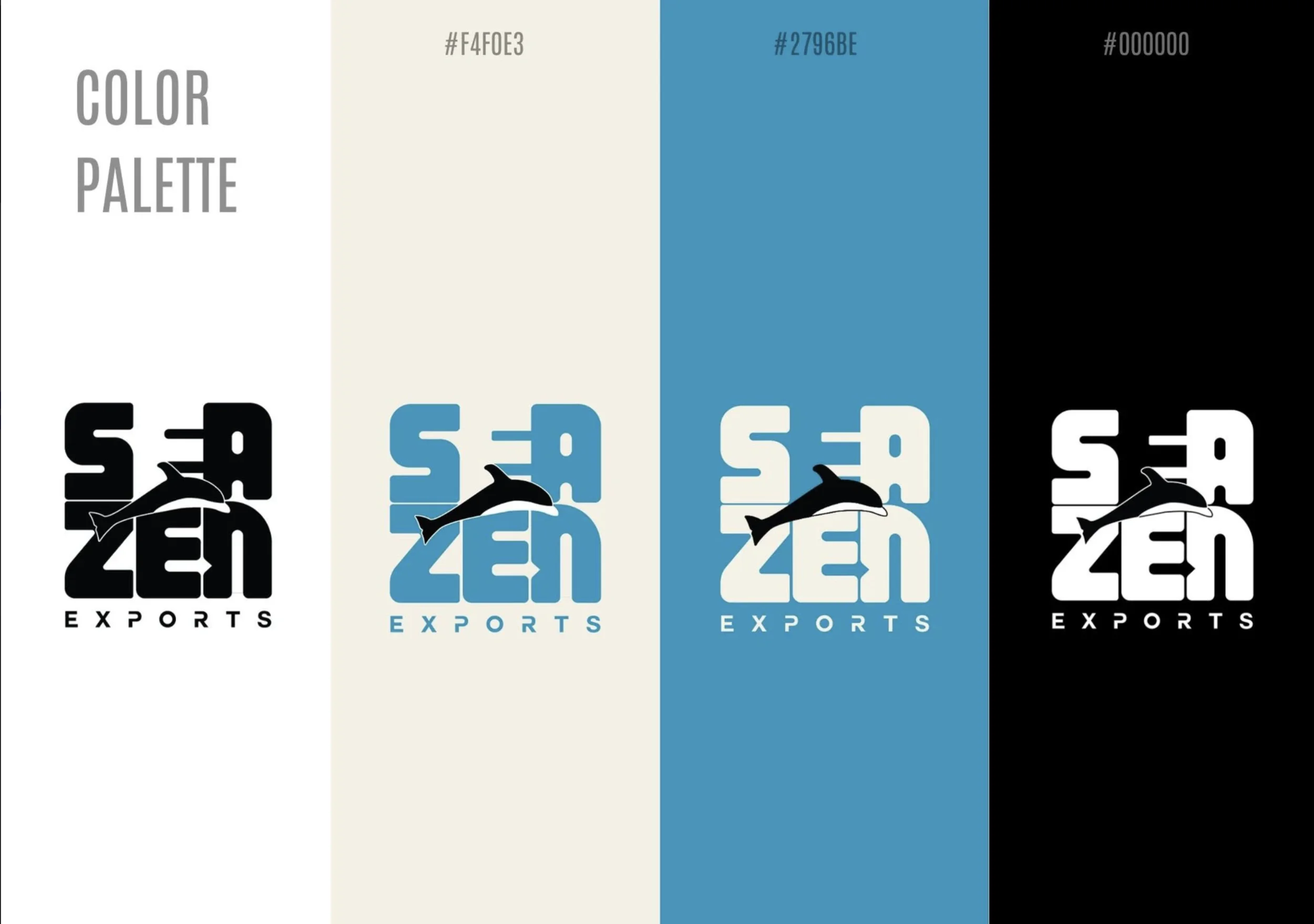
Powerful yet natural — inspired by the seaside.
While keeping the logo powerful, the goal was to keep it natural and approachable. The palette was inspired by a seaside and beach environment — natural, grounded tones that still ensured strong contrast across all applications.
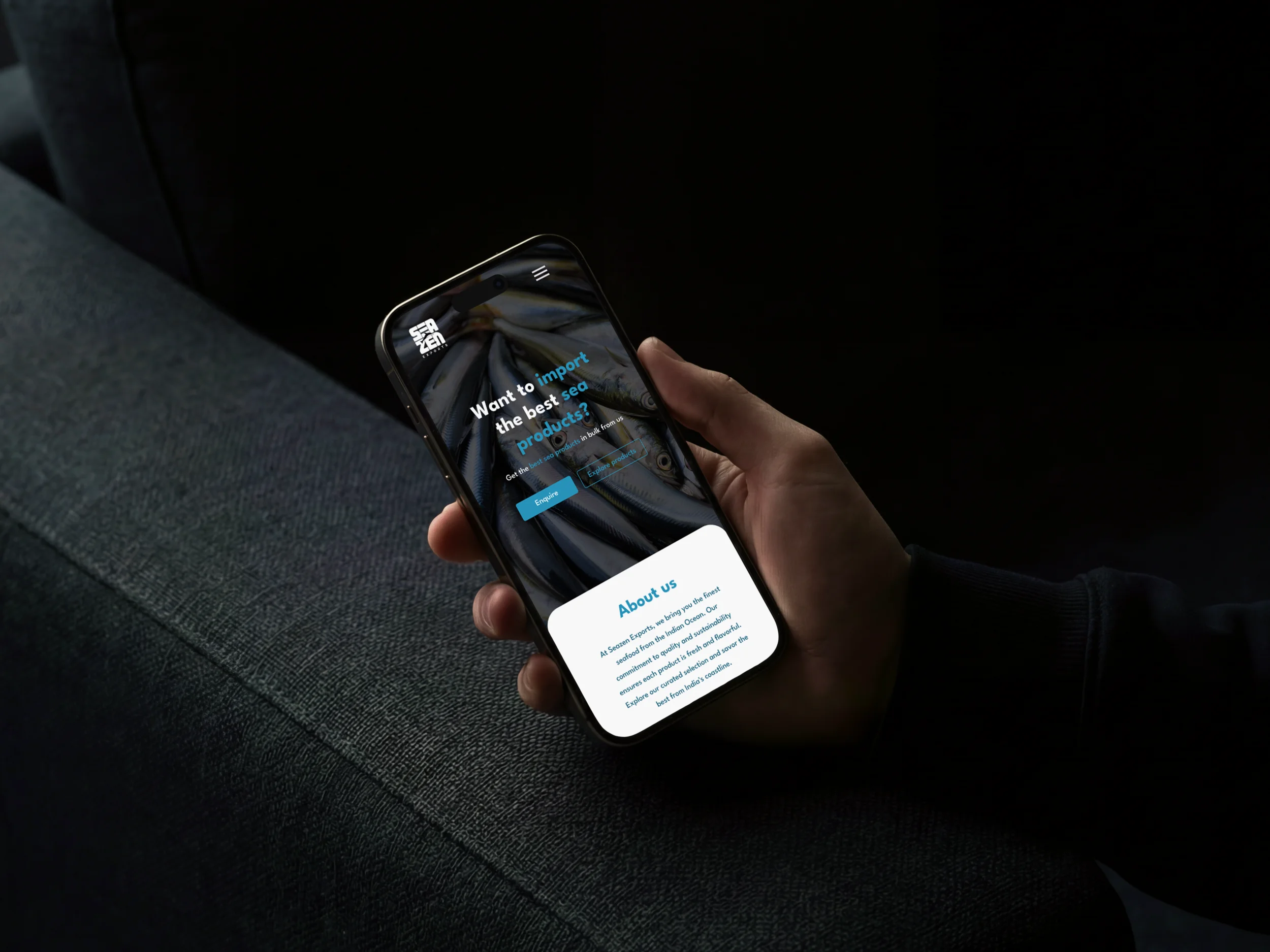
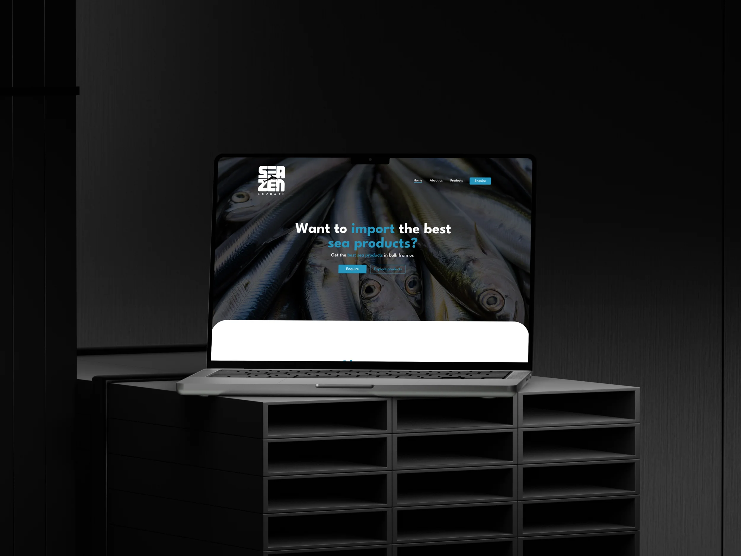
Website
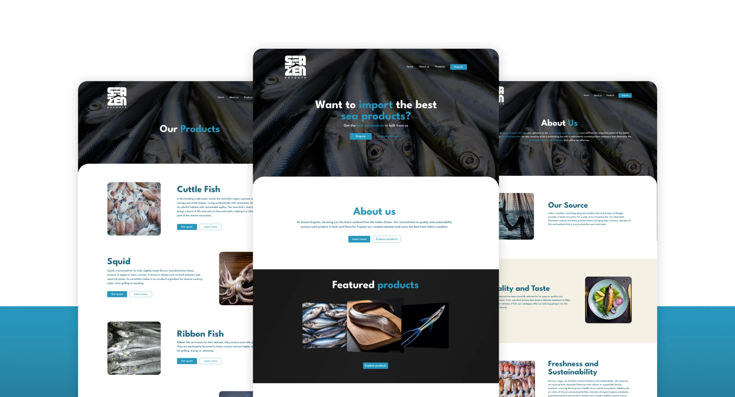
Seazen in digital
we
Identity in Action
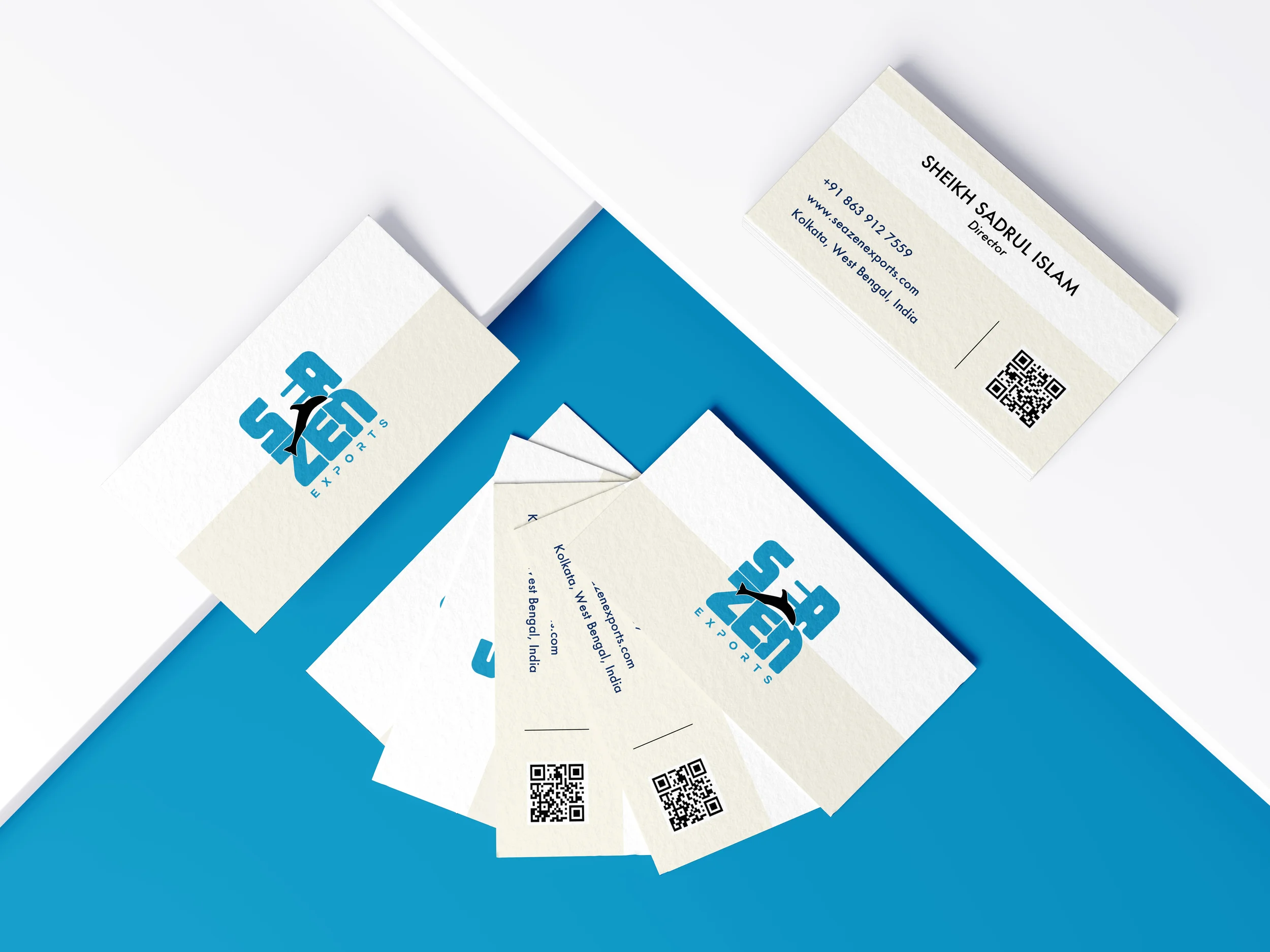
Visible from a distance. Versatile across every surface.
The bold strokes incorporated into the design provide excellent visibility from a distance — a crucial factor in the export industry. Beyond functionality, the logo's versatility allows it to adapt seamlessly across different applications, whether displayed on cargo trucks or featured on company merchandise.
Founder's Review
"The thought put behind the designs shows. Loved the work!"
— Sadrul Islam - Founder, Seazen Exports Pvt. Ltd.