Yesterday
Where past meets present.
A bold, irreverent brand identity and packaging system for a Delhi-based skincare startup combining Ayurvedic ingredients with an unapologetically modern voice.


About
Ayurvedic skincare with a bold, humorous voice.
Yesterday Skincare is a Delhi-based skincare startup focused on combining natural Ayurvedic ingredients with modern skincare needs. Built around the idea of "where the past meets the present," the brand uses doctor-backed, farm-sourced formulations designed for effective everyday skincare.
While maintaining a bold, humorous, and memorable brand voice, Yesterday set out to be everything the typical Ayurvedic skincare brand is not.
The Problem
Boring, artificial, and overly polished.
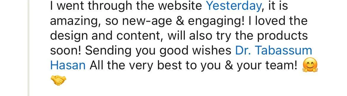
The founders, Dr. Tabassum Hassan and Himanshu Kalra, noticed that most Ayurvedic skincare brands felt boring, artificial, and overly polished. They wanted Yesterday to communicate in a bold, transparent, and unfiltered manner.
The challenge was to design a brand identity that felt unexpected, irreverent, and slightly shocking — while still appearing trustworthy and modern.
The Solution
An identity the founders could confidently stand behind.
We carefully studied the founders' vision through research, competitor analysis, and strategic exploration. Drawing inspiration from brands like Liquid Death and Dollar Shave Club, we developed a brand identity system that aligned with Yesterday's unconventional positioning and tone of voice.
The goal was to create an identity that felt fresh, memorable, and true to the spirit of the brand.
Early Explorations
Sketches, explorations, and visual development.
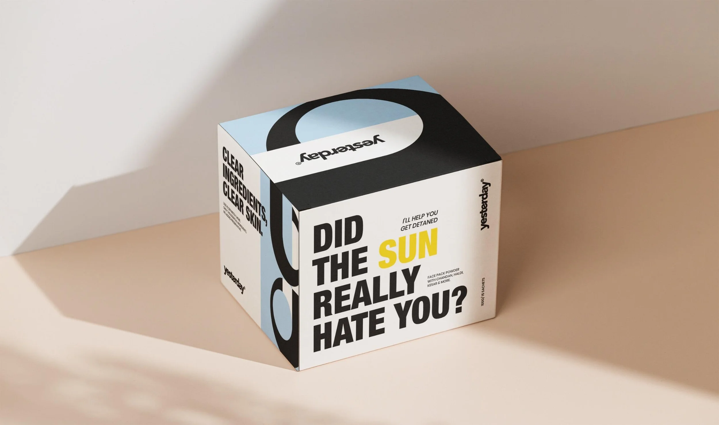
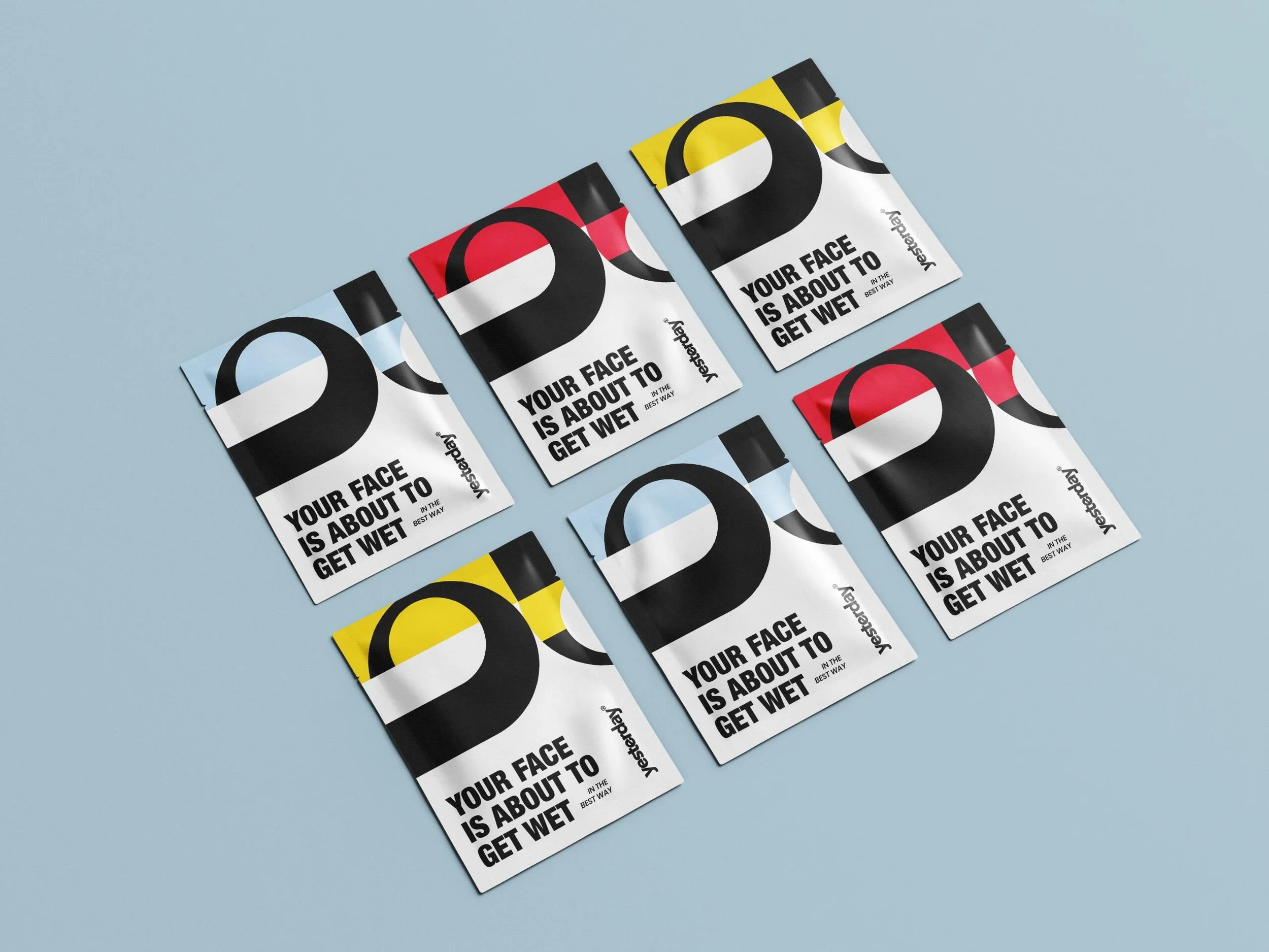
The earlier strategy focused on bringing out a bold and confident identity for Yesterday. We approached this through structured layouts, bold typography, and strong visual contrast, while still maintaining a clean and refined aesthetic.
The reason we did not move forward with this concept was due to a shift in strategy. The founders decided to take the brand in a more personal and irreverent direction, moving away from the earlier bold and structured approach.

Logo & Logomark
Approved concept: The Logo
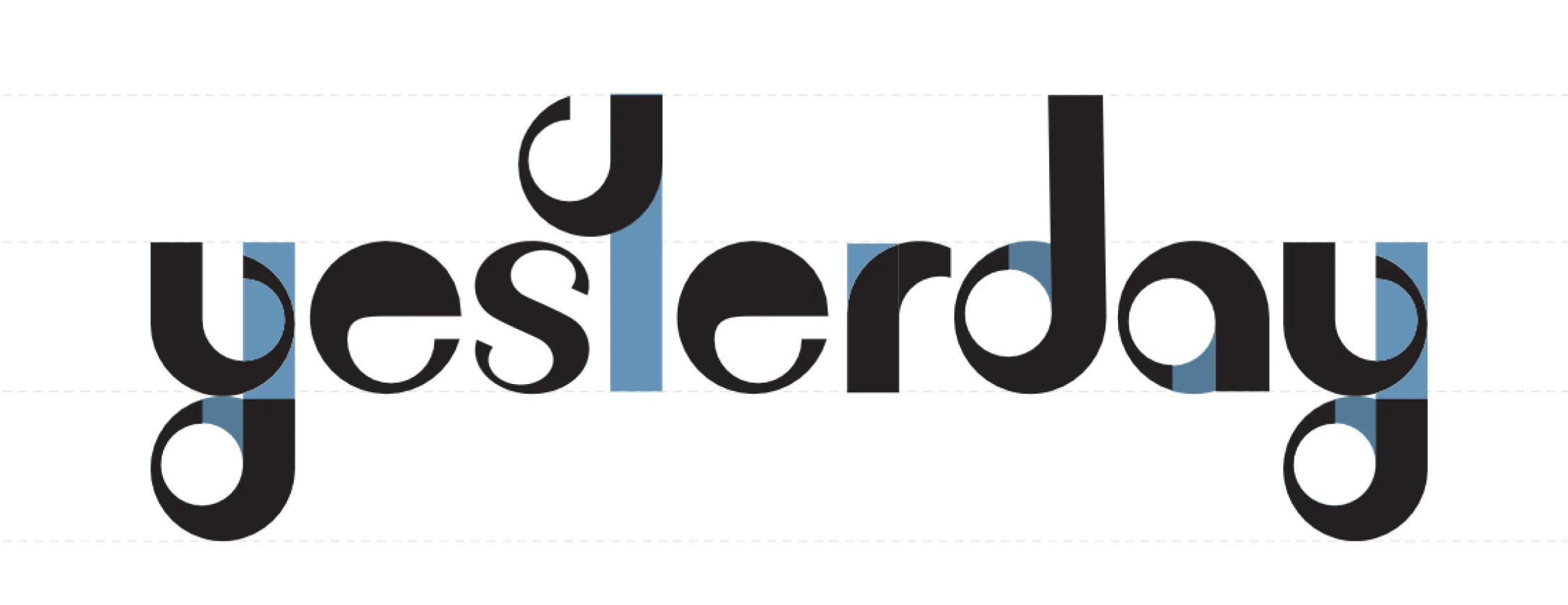
The wordmark was carefully designed to align with the brand strategy and tone while maintaining readability across different sizes and applications. The backward-pointing arrow in the "Y" symbolises the brand's philosophy of drawing from the past to create solutions for the present.
The logomark is derived from the first letter of the wordmark and acts as a simplified substitute for smaller applications — labels, stickers, and compact packaging areas where the full wordmark may not remain legible.


Typography
Personal, raw, and transparent.
The typography system was designed to feel personal, raw, and transparent. Brownist paired with Maku became the primary type combination for the identity. To ensure readability in smaller sizes and functional applications, Poppins was included as a fallback typeface.


Colour System
Lively, clean, modern, and approachable.
The colour palette was designed to make the brand feel lively, clean, modern, and approachable — a deliberate departure from the muted earth tones that saturate the Ayurvedic skincare category.

Packaging
Irreverent, bold, and visually disruptive.
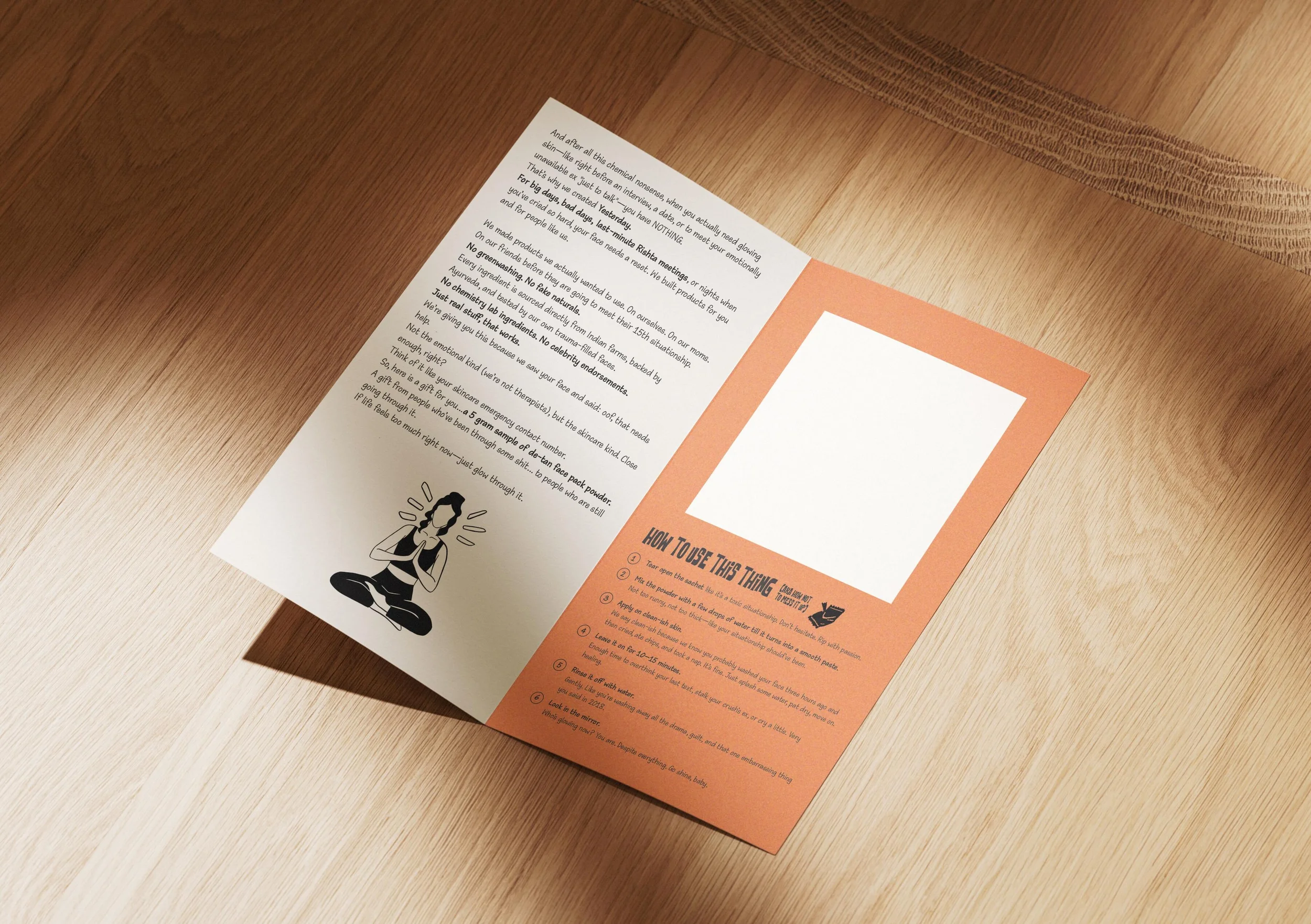
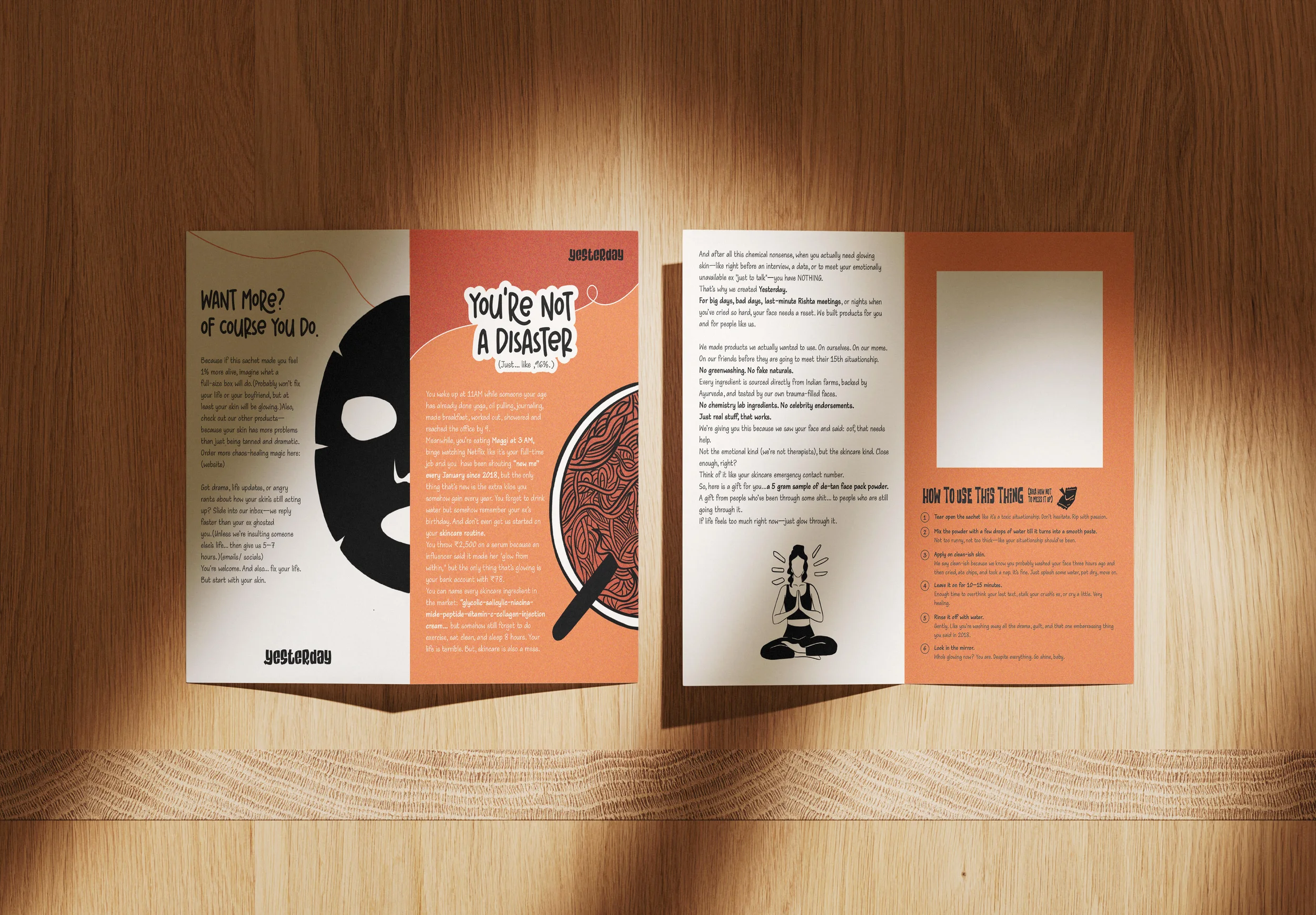
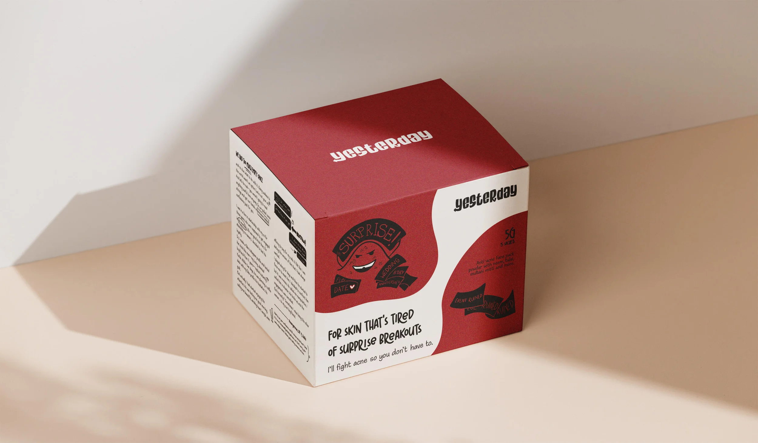
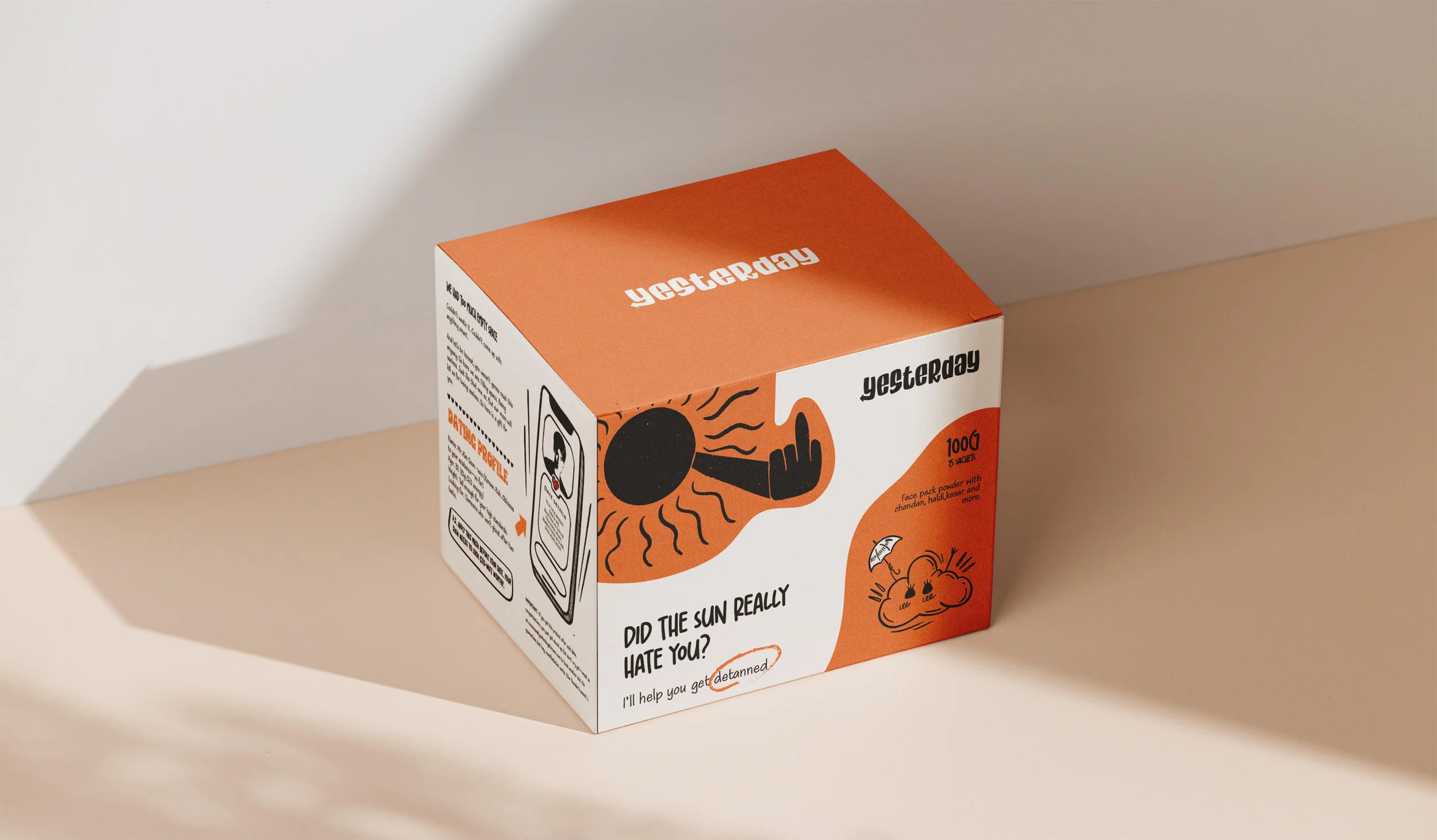
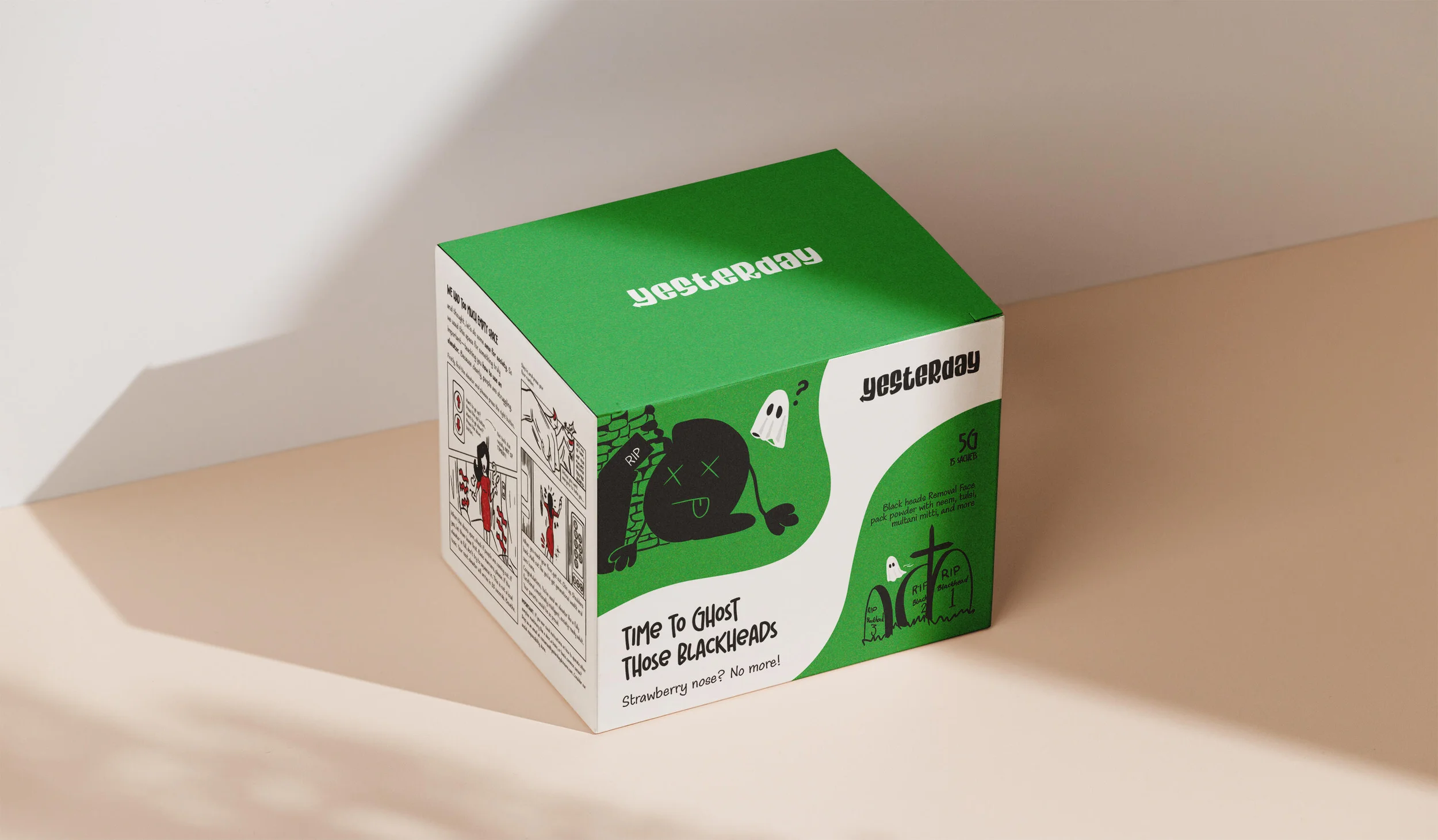
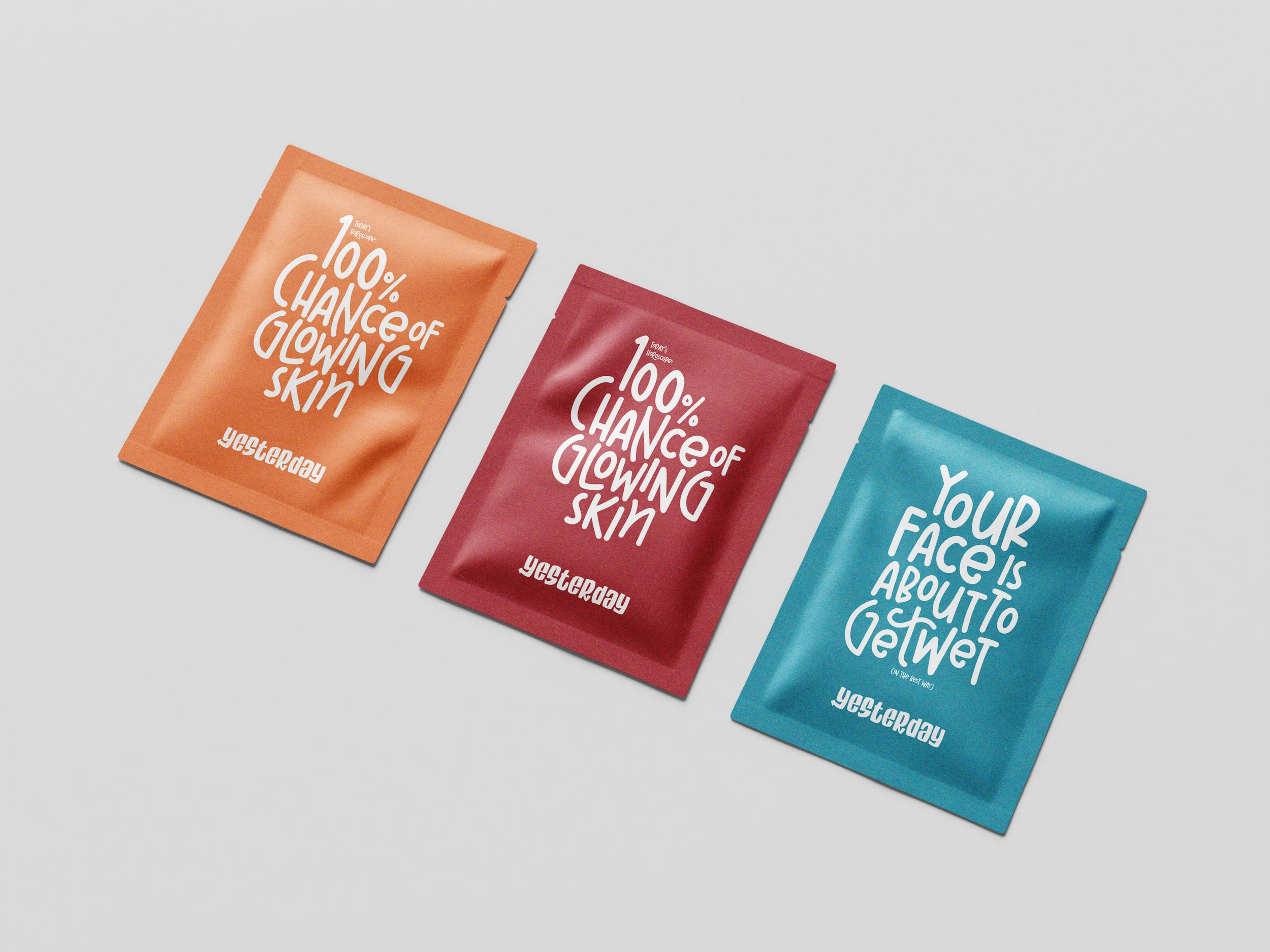
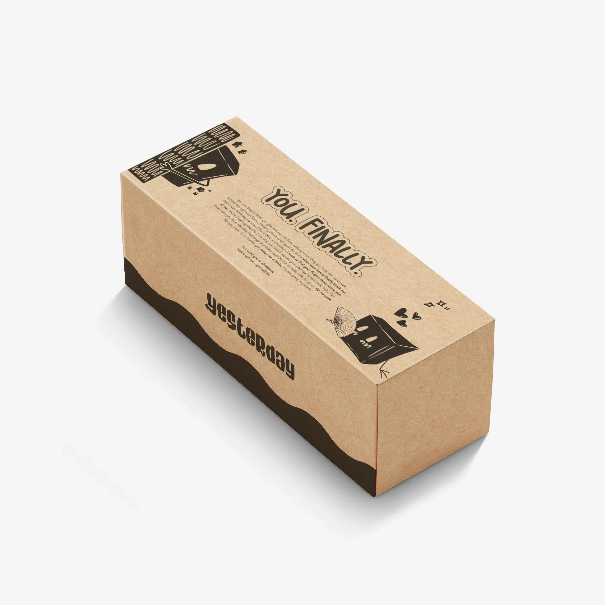
Packaging was one of the most important aspects of the entire project. The founders explicitly wanted it to feel irreverent, bold, and visually disruptive. Each product was designed around a distinct visual story.
The De-Tan pack features the sun showing a middle finger. The Acne pack personifies acne as an angry character. The Blackhead pack depicts dead blackheads in a graveyard scene. The intention was to make the products feel expressive, memorable, and unapologetically bold.
Website
The brand's personality in its rawest form.
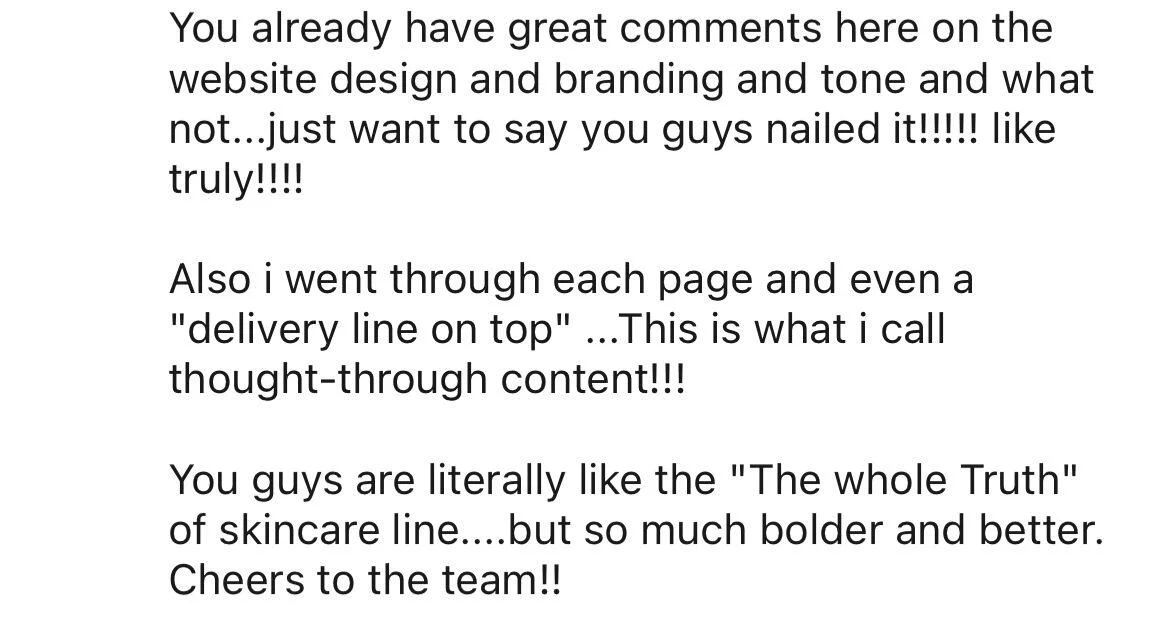
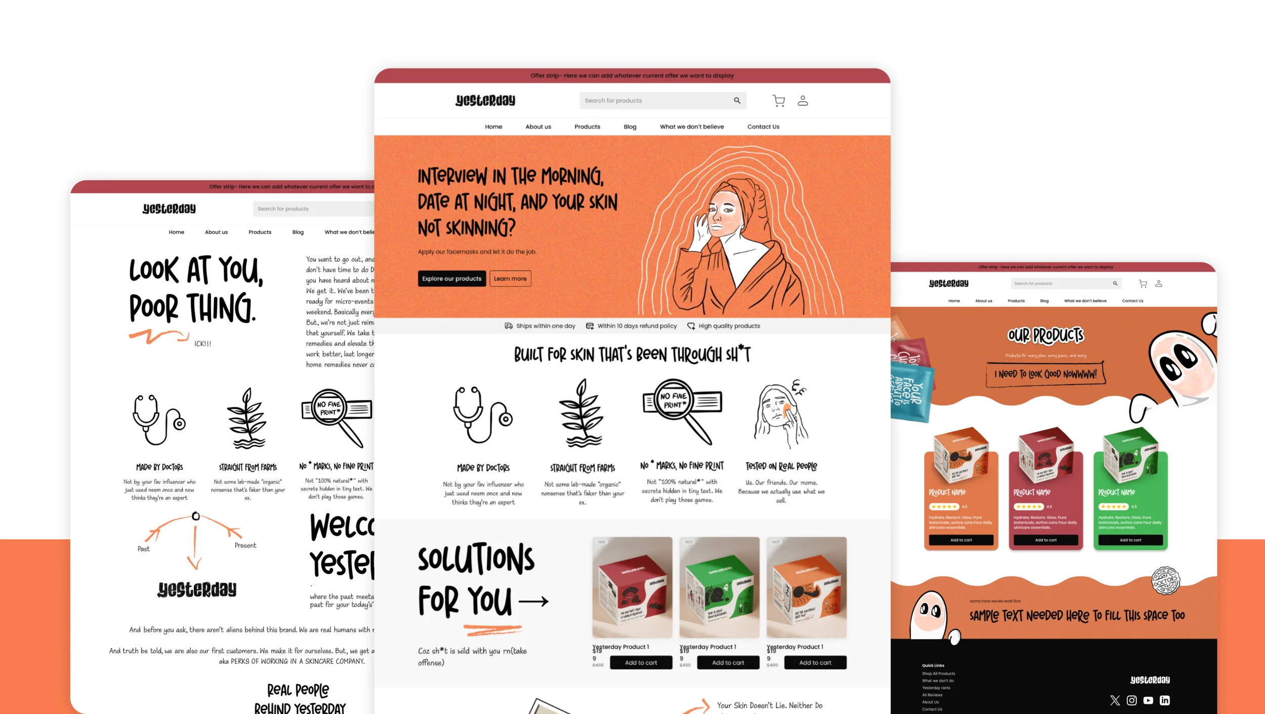
The website became a major touchpoint for communicating the brand's personality to prospective customers. It was designed to express the voice of Yesterday in its rawest and most unfiltered form while remaining functional and easy to navigate.
It is safe to say the approach worked.

Illustrations
Pushing the brand's personality even further.
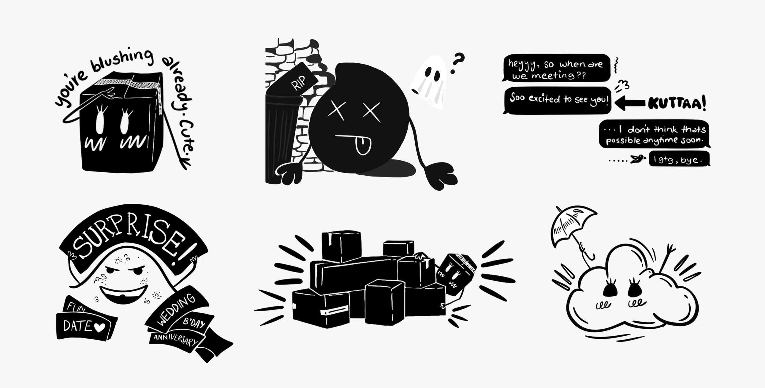
This section gave us the freedom to push the brand's personality even further through experimental and expressive illustrations.
Because who knows — lightning might strike.